Repeatable processes keep organizations running smoothly, but undocumented workflows create confusion and delays. This guide explains eight practical workflow diagrams—when to use them, why they work, and step-by-step tips to map, analyze, and automate processes for faster results.
November 3, 2025 (7mo ago) — last updated December 16, 2025 (6mo ago)
8 Essential Workflow Diagrams for 2025
Explore 8 essential workflow diagrams with practical tips to map, analyze, and automate processes for better efficiency.
← Back to blog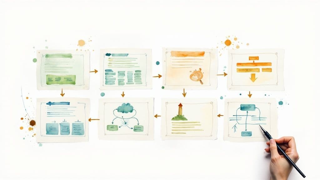
8 Essential Workflow Diagrams for 2025
Summary: Explore 8 essential workflow diagrams with practical tips to map, analyze, and automate processes for better efficiency and clearer handoffs.
Introduction
Repeatable processes keep organizations running smoothly, but undocumented workflows lead to confusion, delays, and hidden costs. Workflow diagrams turn messy procedures into clear, actionable maps that reveal bottlenecks, clarify ownership, and enable automation. This article walks through eight real-world diagram types—when to use each, how they help, and practical tips to get results quickly.
1. Business Process Model and Notation (BPMN)
Business Process Model and Notation (BPMN) is the standard visual language for modeling detailed, unambiguous workflows. It uses defined symbols for events (circles), activities (rectangles), and gateways (diamonds) so business and technical teams share a single, precise representation of a process. BPMN diagrams can be executable with the right tooling, turning a visual model into an automated workflow.1
Why BPMN works
BPMN’s formal grammar removes guesswork, which is critical for regulated or high-risk processes—bank loan approvals and insurance claims are common examples. When accuracy matters, BPMN provides a “single source of truth.”
Actionable takeaways
- Start with basic symbols: tasks, sequence flows, and exclusive gateways. Get the fundamentals right before adding complexity.
- Use pools and lanes to show responsibility (Sales, Finance, Legal).
- Document gateway logic (e.g., “Credit Score > 700”).
- Review and sign off with all stakeholders before automation.
2. Flowchart Diagrams
Flowcharts are the classic, easy-to-read diagrams for expressing step-by-step logic. Ovals mark start/end, rectangles show actions, and diamonds show decisions. Their simplicity makes them ideal for training, SOPs, and fast communication.
Why flowcharts work
Flowcharts are fast to create and accessible to nontechnical audiences, which makes them perfect for onboarding and quick troubleshooting guides.
Actionable takeaways
- Use standard symbols consistently.
- Keep each flowchart to one page; split large processes into linked charts.
- Keep labels short and action-oriented.
- Design top-to-bottom, left-to-right for intuitive reading.
3. Swimlane Diagrams (Cross-Functional Flowcharts)
Swimlanes divide a process into lanes for each person, team, or system, showing clearly who owns each step. They’re excellent for revealing handoffs and coordination gaps.
Why swimlanes work
A swimlane diagram highlights cross-functional dependencies—order fulfillment or employee onboarding are common use cases—so teams can see exactly where handoffs cause delays.
Actionable takeaways
- List every stakeholder first; each gets a lane.
- Minimize handoffs—each crossing arrow is a potential delay.
- Use precise lane labels like “Warehouse Team” or “Customer Support — Tier 2.”
- Create diagrams collaboratively with representatives from each lane.
4. Data Flow Diagrams (DFD)
DFDs map how information moves through a system: external entities, processes, data stores, and data flows. They’re focused on data architecture rather than task order, which helps systems analysts and database architects understand information dependencies.2
Why DFDs work
DFDs reveal where data is created, transformed, and stored, which is crucial for system design, integrations, and compliance.
Actionable takeaways
- Start with a Level 0 Context Diagram to define system boundaries.
- Ensure inputs and outputs align across levels—data shouldn’t disappear between diagrams.
- Use clear, specific names for data flows and stores.
- Validate diagrams with business analysts, developers, and end users.
5. Gantt Charts
Gantt charts map tasks against time, showing start/end dates, durations, and dependencies. They answer “when” rather than “how,” making them indispensable for project planning and scheduling.
Why Gantt charts work
Gantt charts help teams spot overlaps, schedule dependencies, and the critical path so they can manage timelines and resources effectively.3
Actionable takeaways
- Map task dependencies explicitly.
- Assign a clear owner to every task.
- Mark milestones to track major progress points.
- Treat Gantt charts as living documents—update them regularly.
6. Value Stream Mapping (VSM)
Value Stream Mapping is a lean tool for mapping current and future states of material and information flow. It separates value-added time from non-value-added lead time and prioritizes waste elimination—originating in the Toyota Production System.4
Why VSM works
VSM forces a customer-centric view of processes and quantifies waste, making it ideal for lean transformations in manufacturing and operations.
Actionable takeaways
- Go to the gemba—observe the process where work happens.
- Include frontline staff in mapping to capture real-world steps and delays.
- Measure process times, wait times, and inventory levels.
- Design a future-state map focused on continuous flow and waste removal.
7. Sequence Diagrams (UML)
Sequence diagrams show time-ordered interactions between system components using lifelines and message arrows. They’re a developer’s tool for mapping API calls, microservice interactions, and protocol flows.5
Why sequence diagrams work
They clarify timing, ordering, and error scenarios—helping teams identify race conditions or unnecessary calls before code is written.
Actionable takeaways
- Tie each diagram to a specific use case (e.g., “User Login”).
- Show time as top-to-bottom flow.
- Include alternative and error flows (alt, opt fragments).
- Review with developers, architects, and QA.
8. Decision Trees
Decision trees map choices and outcomes in a tree structure and translate naturally into rule-based logic and many machine-learning models. They’re intuitive for stakeholders and precise enough to support automation and risk scoring.6
Why decision trees work
They turn complex criteria into clear if–then rules, useful for loan decisions, diagnostics, and classification tasks.
Actionable takeaways
- Place the most important criterion at the root.
- Add probabilities where possible to quantify expected outcomes.
- Prune branches to avoid overfitting and keep the tree simple.
- Validate decision rules with subject matter experts.
Comparison at a Glance
| Diagram | Complexity | Best for | Key advantage |
|---|---|---|---|
| BPMN | High | Enterprise automation, regulated processes | Standardized, automation-ready |
| Flowchart | Low | Training, SOPs, simple logic | Fast and accessible |
| Swimlane | Medium | Cross-department workflows | Clarifies ownership and handoffs |
| DFD | Medium–High | System design, integrations | Shows data movement and stores |
| Gantt | Medium | Project scheduling | Timeline and critical path visibility |
| VSM | High | Lean process improvement | Quantifies waste and lead time |
| Sequence (UML) | High | API/microservices design | Timing and interactions clarity |
| Decision Tree | Medium | Rule-based decisions, ML | Intuitive rules and explainability |
Final Thoughts
The right diagram depends on your goal: clarity, ownership, timing, data structure, or automation. Diagrams shouldn’t sit in a drawer—they’re living tools for continuous improvement. Start with one painful process, map the current state, brainstorm fixes, and iterate toward a cleaner, faster workflow.
Key insights to carry forward
- Clarity beats complexity—keep diagrams simple enough to communicate instantly.
- Match the diagram to your audience and purpose.
- Use diagrams to start conversations and expose misalignments.
- Start small and iterate—tackle one process, prove the value, then scale.
Practical next steps
- Find a problem process that causes repeated friction.
- Choose the diagram type that fits the problem (swimlane for handoffs, VSM for waste, BPMN for automation).
- Map the current “as-is” process with those who do the work.
- Analyze, brainstorm improvements, and design the “to-be” process.
Mastering workflow visualization builds resilience and scale by making processes visible, measurable, and improvable. Start mapping today with collaborative tools that let you build, share, and iterate in real time.
Frequently Asked Questions
Q: Which diagram should I start with for a cross-team process?
A: Start with a swimlane diagram to clarify responsibilities and handoffs, then use BPMN or a flowchart for detailed steps.
Q: How do I choose between BPMN and a flowchart?
A: Use a flowchart for simple communication and training; choose BPMN when you need precision, standards, or automation.
Q: Can diagrams help with automation?
A: Yes—BPMN and well-documented decision rules can be fed into workflow engines and automation tools to reduce manual work.
1.
Object Management Group, “Business Process Model and Notation (BPMN) Version 2.0,” https://www.omg.org/spec/BPMN/2.0/
2.
Lucidchart, “Data Flow Diagram (DFD) Tutorial,” https://www.lucidchart.com/pages/data-flow-diagram
3.
Asana, “What Is a Gantt Chart? Your Guide to Easy Project Scheduling,” https://asana.com/resources/gantt-chart-basics
4.
Lean Enterprise Institute, “Value Stream Mapping,” https://www.lean.org/lean-post/value-stream-mapping/
5.
Martin Fowler, “UML,” https://martinfowler.com/uml.html
6.
scikit-learn, “Decision Trees,” https://scikit-learn.org/stable/modules/tree.html
Ready to build and collaborate on diagrams? Fluidwave makes it easy to create, share, and iterate on workflows—start visualizing your processes today at https://fluidwave.com.
Focus on What Matters.
Experience lightning-fast task management with AI-powered workflows. Our automation helps busy professionals save 4+ hours weekly.