Project tracking metrics are the vital signs of your initiative. They turn goals into measurable signals so you can spot risks early, align stakeholders, and make confident, timely decisions.
July 5, 2025 (1y ago) — last updated December 10, 2025 (6mo ago)
Project Tracking Metrics: KPIs & Best Practices
Choose, implement, and visualize the KPIs that reveal project health and drive predictable outcomes.
← Back to blog
Project Tracking Metrics: KPIs & Best Practices
Unlock project success by choosing, implementing, and visualizing the KPIs that reveal project health and drive predictable results.
Introduction
Project tracking metrics are the vital signs of your initiative. They turn broad goals into concrete data so you can spot risks early, keep stakeholders aligned, and make confident decisions that move the project forward.
At its core, tracking the right metrics helps you answer three essential questions: Are we on schedule? Are we on budget? Is the team delivering quality work sustainably?
Why Project Tracking Metrics Are Your Compass

Managing a complex project by gut alone is like steering a ship without a compass. Metrics give you objective feedback on timeline, cost, quality, and team capacity so you can act before small problems become crises.
These indicators aren’t just numbers on a screen; they tell the story of your project’s journey. They show where you stand, where you’re headed, and which obstacles are likely to appear, empowering proactive decisions rather than constant firefighting.
From Data Points to Direction
Without clear metrics, you can’t tell whether busyness equals progress. Metrics convert activity into measurable outcomes so teams can deliver predictable results. Businesses increasingly invest in structured project tracking—the global project portfolio management market was valued at an estimated $6.13 billion in 2024, with strong projected growth 1.
Metrics help you answer make-or-break questions:
- Are we on schedule? (Schedule Performance Index, SPI)
- Are we staying within budget? (Cost Performance Index, CPI)
- Is quality where it needs to be? (Defect density, rework levels)
- Is the team’s workload sustainable? (Velocity, resource utilization)
Core Categories of Project Tracking Metrics
To understand project health, use a balanced set of categories so you don’t get a skewed view from any single indicator.
| Metric Category | What It Measures | Example Metric |
|---|---|---|
| Schedule Performance | Timeline progress against the plan | Schedule Variance (SV) |
| Financial Health | Spending compared with budget and value delivered | Cost Performance Index (CPI) |
| Work Quality | Standards of deliverables and defect trends | Defect Density |
| Team & Productivity | Team efficiency and output | Team Velocity |
| Risk & Issues | Count and impact of risks and problems | Number of Open Issues |
Mastering these categories is the first step toward a tracking system that actively drives better outcomes.
The Four Pillars of Project Measurement
Organize metrics into four core areas: Schedule, Budget, Quality, and Team Performance. Together they form a complete picture that prevents overemphasis on any single dimension.
Pillar 1: Schedule Performance
Schedule metrics answer “Are we on time?” and—more importantly—“How far off are we and why?” Metrics like Schedule Performance Index (SPI) and Schedule Variance (SV) quantify timing deviations and enable realistic forecasts. For example, an SPI of 0.85 means you’re completing 85 cents of planned work for every dollar of scheduled time.
Pillar 2: Budget and Financial Health
Budget metrics show whether you’re getting value for every dollar spent. Earned Value Management (EVM) tools such as Cost Performance Index (CPI) and Cost Variance (CV) compare the value of work completed with actual costs. A CPI of 1.2 means $1.20 of work value for every dollar spent; a low CPI signals inefficiency and possible waste 2.
Pillar 3: Quality and Stakeholder Satisfaction
Quality metrics ensure the product actually meets needs. Track rework levels, customer satisfaction scores, and defect density to prevent delivering a project that’s on time and on budget but still fails to satisfy users.
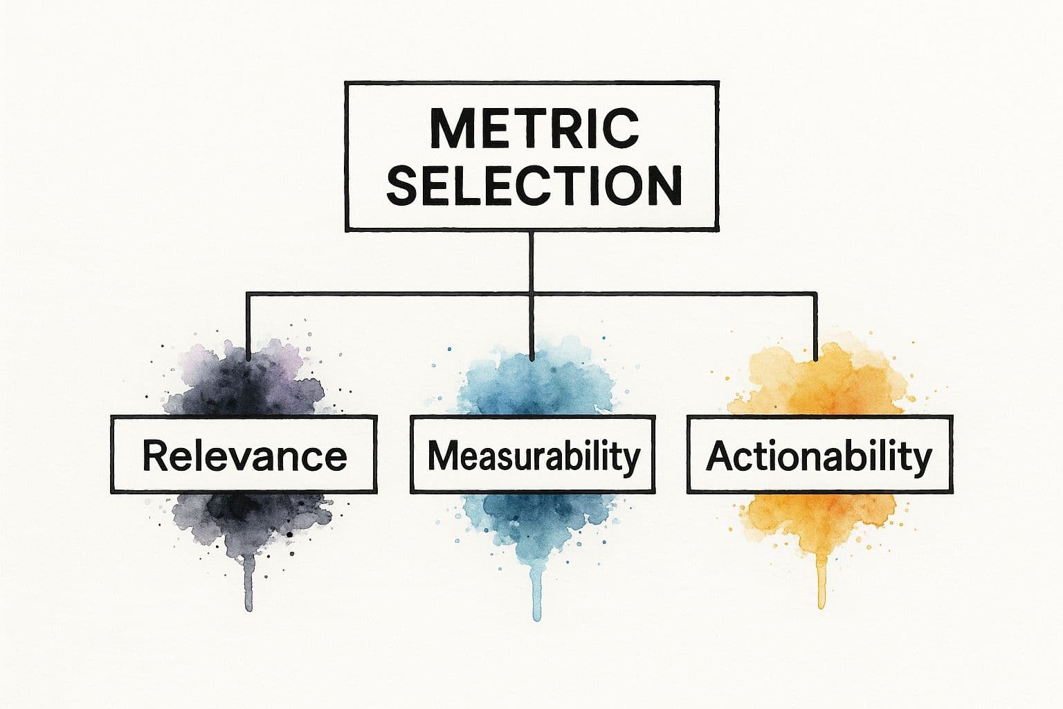
A metric is useless unless it’s relevant, measurable, and actionable.
Pillar 4: Team Performance and Workload
The team is the engine of the project. Track team velocity, resource utilization, and cycle time to understand capacity and protect against burnout. Visual tools like Kanban boards make workflow visible and reveal bottlenecks quickly. Balanced workload supports consistent, high-quality delivery.
Selecting Metrics That Actually Matter
Avoid vanity metrics that look good but don’t reflect project health. Instead, choose a concise set of indicators aligned to your goals. A cluttered dashboard creates noise and hides the signals you need to see.
Align Metrics with Your Methodology
Your methodology should guide metric selection. Agile and Waterfall projects need different signals:
Agile teams benefit from:
- Sprint Burndown
- Team Velocity
- Cycle Time
Waterfall projects rely on EVM metrics:
- Cost Performance Index (CPI)
- Schedule Performance Index (SPI)
- Planned Value (PV)
| Metric | Relevance in Agile | Relevance in Waterfall |
|---|---|---|
| Velocity | High | Low |
| Sprint Burndown | High | Low |
| Cycle Time | High | Medium |
| CPI | Medium | High |
| SPI | Medium | High |
| Change Request Volume | Low | High |
A Framework for Choosing Metrics
Ask three questions to pick metrics that matter:
- What does success actually look like for this project?
- What are the biggest risks we must monitor?
- What information do stakeholders need?
Center your dashboard around those answers so metrics drive decisions, not busywork. For more on operational metrics, see our guide to measuring operational efficiency.
Automating Your Project Tracking System
Manual calculations are slow and error prone. Automation turns your project platform into a live GPS—continuous, accurate, and actionable data without constant manual effort.
The Power of Project Management Software
Modern platforms like Fluidwave, Jira, and Asana become single sources of truth. When tasks and updates live in one system, the software can calculate SPI, CPI, velocity, and burndown automatically. Teams that adopt automation see markedly better on-time delivery rates 3.
Benefits of automation:
- No more manual data entry
- Fewer human errors
- Real-time visibility for all stakeholders
Configuring Your Automated Dashboard
A great dashboard highlights the few metrics that matter. For an Agile team, include a sprint burndown, velocity chart, and cycle time report. For construction or Waterfall work, surface earned value metrics like CPI and SPI and flag values below 1.0 as alerts.
Automation frees managers from data collection so they can focus on interpreting data and removing blockers.
Communicating Project Health with Data Visualization

Raw tables don’t inspire action. Visualization turns numbers into a clear story that both executives and teams can use. Good visuals answer three quick questions: Are we on schedule? Are we on budget? Are there major roadblocks?
Research shows communication failures are a leading cause of wasted time, so visual clarity matters4.
Matching Charts to Metrics
- Burndown charts — progress over time in Agile
- Gantt charts — dependencies and timelines
- Pie/donut charts — budget or resource breakdowns
- Kanban boards — workflow and bottlenecks
Design dashboards for the audience: high-level KPIs for execs, tactical charts for teams. Tools like Fluidwave pull data automatically into visuals so dashboards stay current.
Common Project Tracking Pitfalls to Avoid
Even with good intentions, teams stumble. Here are frequent traps and how to avoid them.
Vanity Metrics and Misuse
Vanity metrics look good but don’t reflect outcomes. Always connect metrics to business goals so numbers lead to real decisions.
Don’t Use Metrics as a Weapon
If metrics become punitive, teams will game them. Use data as a flashlight to illuminate problems and support learning. Create psychological safety by asking, “What’s blocking the team?” rather than assigning blame.
Inconsistent Tracking
If teams update progress at different cadences, your data becomes unreliable. Set a clear rhythm for updates and use a centralized platform to keep everyone aligned. Project performance is similar across work models when processes are consistent, so disciplined tracking matters more than where people sit5.
To build metric-driven habits:
- Involve the team in metric selection
- Start with two or three core metrics
- Celebrate improvements, not just call out failures
Frequently Asked Questions About Project Metrics
How often should I review metrics?
It depends on your project rhythm. Agile teams should monitor burndown daily; Waterfall teams typically use weekly or bi-weekly reviews of SPI and CPI.
What’s the single most important metric?
There’s no single magic number. If pressed, EVM metrics like CPI and SPI give strong, predictive signals because they combine time and cost into one view.
How do I get team buy-in?
Involve the team in choosing metrics, be transparent with data, and use metrics to guide decisions so the team sees value rather than punishment.
Quick Q&A
Q: Which three metrics should small teams start with?
A: Sprint burndown or progress percent, team velocity or throughput, and a basic quality measure such as defect count or rework percentage.
Q: Can I track metrics without paid software?
A: Yes. Spreadsheets can calculate CPI, SPI, and simple burndowns, but automation reduces errors and saves time.
Q: What’s the best way to present metrics to executives?
A: Use a concise dashboard with red‑amber‑green status, CPI, SPI, and top risks so execs see health at a glance.
Ready to stop chasing numbers and start making smarter decisions? Fluidwave combines task management with automated tracking for a real-time view of project health. Get started for free at https://fluidwave.com.
1.
PM360 Consulting, “25 Project Management Statistics to Guide Your Plans in 2025,” [https://pm360consulting.ie/25-project-management-statistics-to-guide-your-plans-in-2025/]
2.
ElectroIQ, Project management statistics and insights, [https://electroiq.com/stats/project-management-statistics/]
3.
ElectroIQ, Project management statistics and insights (on tool adoption and delivery outcomes), [https://electroiq.com/stats/project-management-statistics/]
4.
ElectroIQ, Communication and project outcomes statistics, [https://electroiq.com/stats/project-management-statistics/]
5.
Fluidwave, Tracking project progress guide, [https://fluidwave.com/blog/tracking-project-progress]
Focus on What Matters.
Experience lightning-fast task management with AI-powered workflows. Our automation helps busy professionals save 4+ hours weekly.