Explore what is a PERT chart, its critical path method, task estimation, and how it helps manage complex projects effectively.
March 30, 2026 (3mo ago)
What Is a PERT Chart: Your Guide to Smarter Project Planning
Explore what is a PERT chart, its critical path method, task estimation, and how it helps manage complex projects effectively.
← Back to blog
When you’re staring down the barrel of a major project—think a full-scale product launch or building a new piece of software from scratch—a simple to-do list just isn't going to cut it. This is where a Program Evaluation and Review Technique (PERT) chart comes into play. It’s a project management tool made to map out tasks, show how they connect, and figure out a realistic timeline, especially when you’re dealing with a lot of unknowns.
Think of it less as a schedule and more as a strategic map for navigating complex work.
Untangling Project Complexity With PERT Charts
Let's use an analogy. Imagine you're building a custom home from the ground up. You know you can’t install the roof before the walls are framed, and you certainly can’t paint those walls until the drywall is up and finished. A PERT chart acts as a detailed blueprint for this whole process, showing you not just what needs to get done, but the exact order it all has to happen in.

Unlike a basic timeline, a PERT chart is a network diagram. Each task is a node (usually a circle or a box), and arrows link these nodes together to show the dependencies between them. This visual approach brings a level of clarity that many other planning tools just can't match.
The Core Components Of A PERT Chart
At its heart, a PERT chart is built on just a few key ideas. These components work together to give you a clear, honest picture of your project’s scope and timeline, moving you from guesswork to a more structured way of thinking.
To help you get a quick handle on these concepts, the table below breaks down the main elements.
PERT Chart at a Glance
| Component | Purpose |
|---|---|
| Tasks and Milestones | The individual jobs and key achievements that make up your project. |
| Dependencies | The relationships between tasks, showing what must be done before another can start. |
| Time Estimates | A weighted average of three different time estimates for each task to account for uncertainty. |
These core elements let managers see the entire project at once, spot potential bottlenecks, and really understand how every piece fits into the larger puzzle.
The real power of a PERT chart lies in its ability to reveal the critical path—the longest sequence of dependent tasks that determines the absolute minimum time your project will take.
Once you know your critical path, you know exactly where to focus your energy. Any delay along this path will directly push back your project's completion date. On the other hand, tasks that aren't on the critical path have some wiggle room, or "slack." This distinction is what makes the PERT method so valuable for managing large, high-stakes projects.
The Three-Point System for Accurate Time Estimates
Let’s be real: just guessing how long a task will take is a recipe for disaster. A single optimistic guess can throw an entire project off schedule, creating a domino effect of delays and budget problems. The PERT method gets around this by replacing single-point guesswork with a much smarter statistical approach called three-point estimation.
This system is really the secret sauce that makes a PERT chart so powerful for dealing with uncertainty. Instead of just asking for one number, it makes you think through a range of outcomes for every single task. It's a small shift in thinking that moves you from simply hoping for the best to actually planning for reality.
Breaking Down the Three Estimates
Let's walk through this with a common task, like "develop a new software feature." To use the three-point system, you won't just pull one number out of the air. You’ll come up with three.
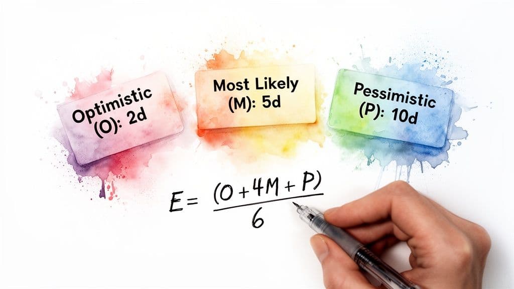
- Optimistic Time (O): This is your best-case scenario. Imagine everything goes perfectly—your team has every resource, they hit zero bugs, and all approvals are instant. How fast could the task get done? We’ll say 3 days.
- Pessimistic Time (P): Now, think about the worst-case scenario (within reason, of course). You uncover surprise technical debt, a key developer is out sick, and stakeholders are slow to give feedback. How long would it take then? Maybe 15 days.
- Most Likely Time (M): This is your gut check—the most realistic estimate based on your experience. Given normal working conditions and the usual bumps in the road, what's the most probable duration? For our feature, let's go with 6 days.
With these three figures in hand, you have a much more complete picture of the task's timeline and the risks involved. You've moved beyond a single point of failure and are now thinking in terms of probability.
Calculating the Expected Time
Once you have your three estimates, you don't just take a simple average. PERT uses a weighted formula to calculate the Expected Time (Te), which deliberately gives more weight to the most likely outcome.
Expected Time (Te) = (O + 4M + P) / 6
This formula is designed to be a bit biased. By multiplying the Most Likely (M) estimate by four, it grounds the final number in reality while still accounting for both the best and worst possibilities. This approach changes how managers can plan for timelines and risk.
Let’s plug in the numbers from our software feature example:
- Te = (3 [Optimistic] + 4 * 6 [Most Likely] + 15 [Pessimistic]) / 6
- Te = (3 + 24 + 15) / 6
- Te = 42 / 6
- Te = 7 days
So, instead of committing to a wildly hopeful 3-day timeline or a doom-and-gloom 15-day one, your plan now has a much more defensible estimate of 7 days. This simple calculation is what turns a PERT chart from a vague diagram into a reliable, data-driven planning tool.
Finding Your Critical Path to Keep Projects on Track
Once you have your realistic time estimates, you can get to the real magic of a PERT chart: finding your project's critical path.
Think of it as the longest chain of connected tasks you have to complete. The total duration of this one path dictates the absolute minimum time it will take to finish the whole project. There's no getting around it.
A PERT chart maps this all out visually, showing how every task depends on another. This flowchart makes the critical path easy to spot—it’s the longest route from your starting point to the finish line.
In this diagram, the path with the longest combined duration is the critical path. If any single task on that path gets delayed, your project’s final deadline will slip. It’s that simple.
Understanding Slack and Float
This brings us to another important concept: slack, which is sometimes called float. Slack is just the amount of "wiggle room" a task has. It’s how long you can delay a task without messing up the next one or pushing back your final delivery date. You can get a better handle on this by properly tracking project progress.
Tasks on the critical path have zero slack. They are so tightly scheduled that a one-day delay immediately impacts your project’s completion date. On the other hand, non-critical tasks have some slack, meaning they can start a bit later without causing a crisis.
By identifying tasks with zero slack, managers can shift from reactive firefighting to proactive management. You know exactly which activities demand your full attention and can't afford to slip.
This is what makes PERT charts so valuable. While a Gantt chart shows a timeline, a PERT chart’s focus on dependencies and the critical path gives you a much deeper strategic view. It uses concepts like Early Start (ES) and Late Start (LS) to show which tasks have flexibility and which have none. You can see how modern tools build on these ideas by exploring project visibility features in platforms like Asana.
Knowing the difference is a game-changer for resource management. If a critical task is falling behind, you can confidently pull people or budget from a non-critical task that has plenty of slack. This lets you focus your team’s energy where it truly matters, making sure the whole project stays on course.
How to Build a PERT Chart Step by Step
Now that we’ve covered the core concepts of time estimates and the critical path, let's walk through how to build a PERT chart from scratch. At first glance, the process might seem a bit academic, but breaking it down into five clear steps makes it surprisingly straightforward. Think of it as drawing a detailed map for your project before you even take the first step.
It’s worth noting that while doing this manually gives you incredible insight, modern project management tools like Fluidwave can handle the heavy lifting of diagramming and calculations. This frees you up to focus on the strategic side of PERT without getting lost in the weeds.
Step 1: Identify All Project Tasks
The first order of business is a classic brain dump: list every single task needed to get the project done. A great way to do this is to start with the final goal and work backward, breaking down big milestones into their smaller, component activities. For any project of significant size, this initial listing is where you prevent things from falling through the cracks later on.
This process of building out a task list is a core project management skill. It’s the same discipline you’d use to create a thorough product launch checklist, where every single action item is mapped out ahead of time.
Step 2: Determine Task Dependencies
Once you have your list, you need to figure out how the tasks relate to each other. Which jobs have to be finished before others can even start? These are your sequential tasks. And which ones can be worked on at the same time? Those are your parallel tasks. This is the step where the "network" in "network diagram" really starts to come to life.
Let's go back to our digital marketing campaign. You can't very well launch the social media ads before the copy is written and the graphics are designed. That makes the ad launch dependent on the copywriting and design tasks.
Step 3: Create the Network Diagram
Now for the visual part. With your tasks and dependencies figured out, you can start drawing the actual PERT chart. Each task becomes a node (usually a circle or a box), and you'll draw arrows between them to represent the dependencies you just identified.
A well-made network diagram is more than just a flowchart; it's a powerful, at-a-glance snapshot of your entire project. It instantly shows you the workflow, how everything is connected, and where potential bottlenecks might be hiding.
Step 4: Estimate Task Times
Here comes the math. You’ll now apply the three-point estimation formula—Expected Time = (O + 4M + P) / 6—to every task on your diagram. Yep, this is the most time-consuming step, but it's also what gives the PERT chart its predictive power and reliability. To keep your numbers organized, using a solid project planning template can be a huge help.
Step 5: Calculate the Critical Path
Finally, you’re ready to find the main artery of your project. With all the tasks and their expected times on your diagram, you just need to add up the durations for every possible path from start to finish. The path with the longest total time is your critical path.
This diagram does a great job of showing how the critical path stands apart from all other routes through the project.
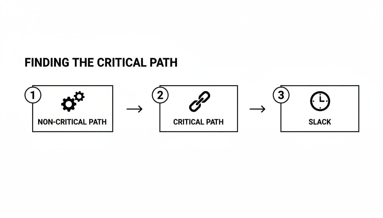
As you can see, any task on the critical path has zero "slack" or flexibility—any delay there directly delays the entire project. Tasks on other, non-critical paths have some wiggle room. Pinpointing this path is the ultimate payoff, because it tells you exactly which tasks demand your full attention to keep everything on schedule.
PERT Charts Versus Gantt Charts: Which Is Right for You?
When you get into project planning, you’ll inevitably hear two tools mentioned in the same breath: PERT charts and Gantt charts. It’s a common point of confusion, and a lot of people wonder which one is "better."
But that’s the wrong way to look at it. The real question isn't about which tool is superior, but which one is right for the specific job you need to do.
Think of it like this: a PERT chart is the architect's structural blueprint, while a Gantt chart is the construction foreman's work schedule. One is for high-level strategic planning and risk assessment, while the other is for on-the-ground execution and day-to-day tracking. They serve very different needs.
The Planning Tool vs. The Tracking Tool
The biggest difference boils down to when and why you use them. A PERT chart is basically a planning tool, designed for use before a project ever kicks off. Its whole purpose is to map out complex task relationships and use weighted time estimates to find your project's critical path.
This makes it perfect for large-scale, uncertain projects where just figuring out the sequence of events is a massive challenge in itself.
A Gantt chart, on the other hand, is a tracking tool used during the project. It’s brilliant at showing the project schedule against a calendar timeline. If you need to see who is doing what and whether they’re on schedule, a Gantt chart gives you that clear, visual answer. To see this in action, you can learn more about how to create a Gantt chart for scheduling your work.
The simplest way to think about it is this: Use a PERT chart to figure out your timeline. Use a Gantt chart to manage your project against that timeline.
A Direct Comparison
To make the choice even clearer, let's put them side-by-side. The table below highlights the key differences to help you decide which tool fits your current needs.
PERT Chart vs. Gantt Chart Key Differences
This table directly compares PERT and Gantt charts across several key features to help you decide which tool best fits your project needs.
| Feature | PERT Chart | Gantt Chart |
|---|---|---|
| Primary Focus | Task dependencies and critical path analysis. | Task scheduling and progress tracking. |
| Visualization Style | A network or flowchart diagram. | A horizontal bar chart against a calendar. |
| Ideal Use Case | Complex, uncertain projects with many interdependencies. | Simpler, linear projects with predictable timelines. |
| Main Strength | Risk management and strategic planning. | Progress monitoring and resource management. |
Ultimately, most experienced project managers don't see it as an either/or choice—they use both tools in tandem. They’ll often start with a PERT chart during the initial planning phase to map all the dependencies and calculate a realistic timeline.
Once that's done, they translate that information into a Gantt chart to manage the project’s execution, track progress, and keep everyone on the same page day in and day out.
A Cold War Innovation for Modern Project Management
The PERT chart might seem like just another diagram in a project manager's toolkit, but its story begins somewhere completely unexpected: the high-stakes world of Cold War military engineering.
This powerful technique has a fascinating history. The Program Evaluation and Review Technique (PERT) was developed in 1958 by the U.S. Navy's Special Projects Office. They were facing a monumental challenge: managing the Polaris nuclear submarine missile project, a massive undertaking with thousands of contractors and staggering complexity. Their old project management methods just weren't cutting it. You can get a deeper dive into how this new approach helped them wrangle the project on industry blogs like monday.com.
The impact was immediate and profound. By using PERT to map out every dependency and pinpoint the most critical tasks, the Navy finished the Polaris project years ahead of schedule.
From Submarines to Software
At first glance, building a nuclear submarine seems a world away from launching a new app or orchestrating a marketing campaign. But the fundamental problems PERT was built to solve—deep uncertainty, complex dependencies, and tight deadlines—are the same ones that keep today's project managers up at night.
The success of the Polaris project proved that even the most intimidating goals can be deconstructed into a predictable, manageable plan. It's a method born from a real-world need for extreme precision and foresight.
Modern teams, whether they're in fast-moving startups or large enterprises, are constantly dealing with projects where the path forward is anything but clear. The variables are endless, and one small delay can easily throw the entire timeline into chaos. This is precisely where the principles of PERT are still so valuable.
Its origin story tells us something important for professionals in 2026: a PERT chart is more than just a theoretical diagram. It’s a strategic framework for imposing order on chaos and anticipating problems instead of just reacting to them—a skill that's as critical now as it was in 1958.
Common Questions About PERT Charts
You've got the theory down, but a few practical questions always come up when managers try to apply PERT charts to their actual work. Let's tackle some of the most common ones I hear.
Is a PERT Chart overkill for a Simple Project?
In a word, yes. While you could technically map out a simple project with a PERT chart, it's a bit like using a sledgehammer to hang a picture frame. The tool's real power shines when you're navigating complex projects filled with uncertainty.
For more straightforward work with just a few dependencies, you'll be far better off with a simple Kanban board or even a well-structured to-do list. My advice? Save PERT for when you're genuinely juggling a lot of moving parts and need to get a handle on risk.
What Are the Main Downsides of a PERT Chart?
The two biggest headaches are subjectivity and complexity. The three-point time estimates are a great concept, but at the end of the day, they're still just educated guesses. If the team's experience is limited or their estimates are way off, the whole project timeline is built on a shaky foundation.
The other major issue is how incredibly time-consuming it is to create and update a PERT chart by hand. This is exactly why most teams today rely on modern project management software to automate the diagramming and calculations. Doing it manually is just too cumbersome for a fast-moving project.
How Does the PERT Method Actually Help with Delegation?
This is one of its most practical and, surprisingly, most overlooked benefits. By clearly separating critical tasks from non-critical ones, a PERT chart gives you a strategic roadmap for delegating work.
Think about it: any task with "slack" or "float" time is a perfect candidate to hand off. These tasks have a built-in buffer, so there's less risk if a team member takes a little longer to complete them. This frees up your senior people or specialists to pour all their energy into the critical path—the sequence of tasks where even a one-day delay pushes back your final deadline.
Effective delegation is the bedrock of smart project management. With Fluidwave, you can map out your entire project and assign tasks to skilled virtual assistants on a pay-per-task model. This ensures your critical path gets the dedicated focus it needs to stay on track. Find out more at https://fluidwave.com.
Focus on What Matters.
Experience lightning-fast task management with AI-powered workflows. Our automation helps busy professionals save 4+ hours weekly.