Learn how to create a Gantt chart with our practical guide. Build dynamic project plans that drive results & keep teams aligned.
March 29, 2026 (3mo ago)
How to Create a Gantt Chart: Your Guide to Dynamic Project Plans
Learn how to create a Gantt chart with our practical guide. Build dynamic project plans that drive results & keep teams aligned.
← Back to blog
At its core, a Gantt chart is just a to-do list with a superpower. It takes a simple list of project tasks, maps them out along a timeline with start and end dates, and then draws the critical lines between them. Suddenly, that messy list becomes a clear, visual roadmap for your entire project.
What Is a Gantt Chart and Why It’s Still a Project Manager's Best Friend
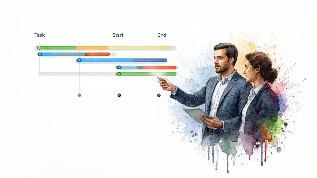
Before we start building, let’s get on the same page about what a Gantt chart actually is. Think of it as a horizontal bar chart that tells the story of your project schedule. It’s a project manager’s secret weapon because it answers the big questions—what needs to happen, who’s doing it, and when—in a single glance.
Don't mistake it for just a bunch of colorful bars on a screen. A well-built Gantt chart is a huge help because it gives you:
- Unmatched Clarity: You can see the entire project, from kickoff to deadline, all in one place.
- Smarter Resource Management: It’s easy to spot who’s overloaded and who has room for more work, which helps prevent burnout and keeps the project moving smoothly.
- Visible Dependencies: The chart clearly shows how tasks are linked. For example, you can’t start “Testing the App” until “Develop Core Features” is marked complete. This is where most projects stumble.
- Real-Time Progress Tracking: A quick look tells you if you're on track, ahead of schedule, or falling behind.
To make sense of any Gantt chart, you just need to understand its fundamental pieces. This table breaks down the core components you'll run into.
Gantt Chart Core Components at a Glance
| Component | What It Does | Why It's Important |
|---|---|---|
| Tasks | Individual project activities or to-do items listed vertically. | Forms the backbone of your project plan; breaks down large goals into manageable steps. |
| Timeline | The horizontal axis showing the project's duration (days, weeks, months). | Provides the context for when everything needs to happen, from start to finish. |
| Bars | Visual representations of tasks on the timeline, showing their duration. | Gives an immediate visual sense of a task's length and its place in the overall schedule. |
| Dependencies | Lines or arrows connecting tasks that must be done in a certain order. | Prevents bottlenecks by showing which tasks are blocking others from starting. |
| Milestones | Key checkpoints or deadlines represented as a single point in time (often a diamond shape). | Highlights major project achievements and deadlines, helping to keep the team focused on key goals. |
Once you can spot these elements, you can read any Gantt chart like a pro. They all work together to tell a clear, cohesive story about your project's health and direction.
The Proven Power of Visual Timelines
This idea of visualizing work isn't new; it’s a time-tested concept with roots stretching back over a century. Picture a Polish steelworks plant in 1896. An engineer named Karol Adamiecki grew frustrated with constant production snags and invented a tool he called the 'harmonogram' to visualize workflows. This precursor to the Gantt chart apparently led to production increases between 100% and 400%.
A few years later, an American engineer, Henry L. Gantt, developed his own version, which the U.S. Army famously used during World War I to manage munitions production. If you're a history buff, you can explore the full origins of the Gantt chart on GanttPRO's blog.
A Gantt chart’s real strength is its ability to translate complex plans into a simple, shared visual language. When everyone can see the plan, they understand their role within it.
The process of building the chart forces you to think through every step of your project from start to finish. This upfront work is where the magic happens—it helps you spot potential roadblocks and resource crunches long before they derail your timeline. It's the difference between proactively managing a project and just reacting to problems.
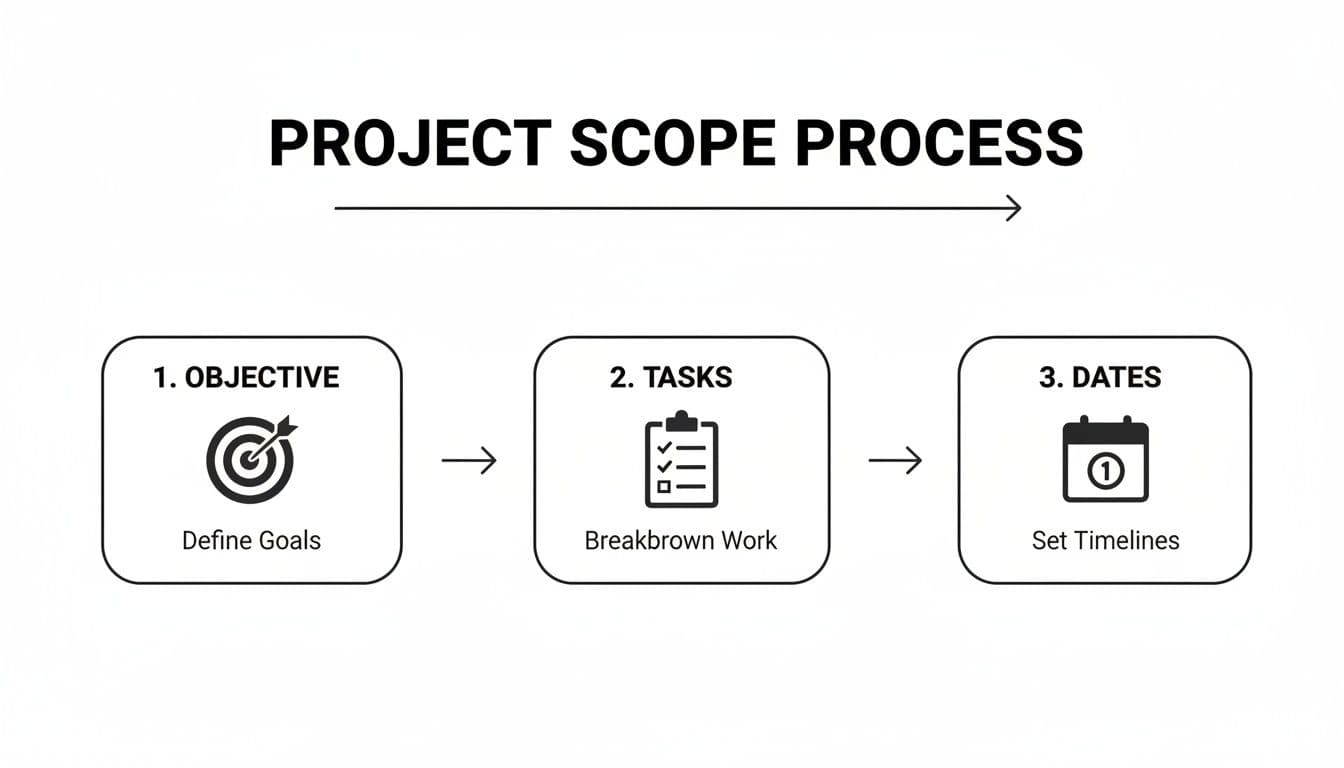
Defining Your Project Scope Before You Draw a Single Bar
I’ve seen it a hundred times: a team gets excited about a new project and immediately jumps into a tool to start building a Gantt chart. It feels productive, but it’s a classic mistake. Rushing to draw bars on a timeline without a solid plan is like trying to build a house without a blueprint. You’re setting yourself up for confusion, missed deadlines, and a lot of painful rework down the line.
The real work starts long before you open a spreadsheet or a project management app. It all begins with a crystal-clear project objective. And I don't mean something vague like "launch a new website." A strong objective is specific, measurable, and anchored to a deadline.
Think more along the lines of: "Launch the new e-commerce website with a fully functional payment gateway and product catalog by October 31st." Everyone on the team needs to know exactly what "done" looks like. When there's no ambiguity, you sidestep scope creep and keep the entire team pulling in the same direction.
Breaking Down Your Objective into Tasks
Once you have that main objective nailed down, it's time to break it into bigger chunks. These are the major phases of your project. For our website launch, that might look something like this:
- Phase 1: Discovery and Design
- Phase 2: Development and Content Creation
- Phase 3: Testing and Quality Assurance
- Phase 4: Launch and Post-Launch Support
This gives you a high-level roadmap, but it's still not granular enough for a Gantt chart. To make this truly actionable, you have to dig deeper. "Discovery and Design" isn't a single task you can check off; it's a collection of smaller, distinct activities.
A well-defined project scope is the difference between a project that feels focused and one that feels chaotic. It transforms a massive goal into a series of achievable steps.
This is where you build what's known as a Work Breakdown Structure (WBS). You take each phase and break it into concrete sub-tasks. For example, under "Discovery and Design," you might list out:
- Conduct stakeholder interviews
- Create UX wireframes
- Develop final UI mockups
Breaking the work down into small, manageable pieces—ideally tasks that take no more than a few days—is the key to accurately estimating time and resources. It makes the entire project feel less overwhelming. If you want a deeper dive, we have a great article on how to write a project scope statement that walks you through it.
Estimating Timelines and Setting Firm Dates
With a detailed list of tasks in hand, you can finally start putting durations against them. And please, be realistic here. One of the most common points of failure I see is wildly optimistic timelines. The best way to avoid this is to talk to the people who will actually be doing the work. They have the hands-on experience to give you a realistic estimate.
Lastly, establish a firm start date and a target end date for the whole project. These two dates are the bookends of your entire schedule. Having a non-negotiable deadline doesn't just create urgency; it forces everyone to prioritize effectively. Now you have a complete blueprint—the objective, the tasks, the durations, and the key dates. This is the raw material you need to build a Gantt chart that actually works.
Building Your Timeline by Mapping Tasks and Dependencies
You’ve done the heavy lifting of breaking your project down into a manageable task list. Now, it's time to transform that list into a living, breathing timeline. This is the point where abstract plans become a concrete schedule, turning your "what" into a "when."
Every single task you identified will now be plotted as a bar on the chart. The length of that bar represents its duration, showing exactly when it starts and when it’s scheduled to end. This simple process is what takes an outline and makes it a powerful management tool.
As you can see, a clear objective is the foundation. From there, you break down the work into tasks, which finally allows you to set realistic dates.
Understanding Task Dependencies
Here’s where a Gantt chart really earns its keep. It’s not just about throwing tasks on a calendar; the real power comes from mapping task dependencies. These are the logical connections that dictate your project's natural flow. Honestly, if you ignore dependencies, you're setting yourself up for a schedule that falls apart the moment you hit your first snag.
There are four types, but you'll find yourself using one far more than the others.
-
Finish-to-Start (FS): This is the most common and intuitive dependency. It simply means Task B can't start until Task A is finished. Think about it: you can't start "Develop App Features" until "Finalize UX Wireframes" is done. This relationship accounts for probably 95% of the dependencies I see in projects.
-
Start-to-Start (SS): This is for tasks that kick off at the same time. Task B can’t begin until Task A begins. For example, you might have "Start Writing Blog Content" and "Start Designing Social Graphics" begin simultaneously once the content strategy is approved.
-
Finish-to-Finish (FF): A bit less common, this means Task B can't be considered complete until Task A is also complete. A good example is "Final System Testing," which can't truly finish until the "Fix Critical Bugs" task is also wrapped up.
-
Start-to-Finish (SF): You'll rarely encounter this one. It means Task B can’t be finished until Task A has started. The classic example is a shift change—the morning guard shift can't end until the evening guard shift has begun.
Once you link tasks with these dependencies, your Gantt chart is no longer just a static picture. It becomes an intelligent model of your project where a delay in one task automatically and visually pushes out all the tasks that depend on it.
Setting Milestones to Mark Key Moments
While tasks represent the work, milestones represent significant achievements. They are crucial signposts on your project map that have zero duration—they happen at a single point in time. I've found that focusing on milestones is one of the best ways to keep a team motivated and stakeholders informed.
Milestones are the project's headline moments. They don’t represent work itself, but rather the completion of a major phase or a critical deliverable.
Instead of getting lost in a sea of small task bars, milestones give everyone clear checkpoints to celebrate. On a Gantt chart, they are often marked with a diamond symbol to make them stand out.
For a website redesign project, your key milestones might be:
- UI/UX Design Approved
- Development Environment Setup Complete
- Alpha Version Ready for Internal Review
- Final Content Loaded
- Go-Live
By putting all these pieces together—your tasks, their durations, dependencies, and key milestones—you create a functional chart that tells a clear story of your project's path from start to finish.
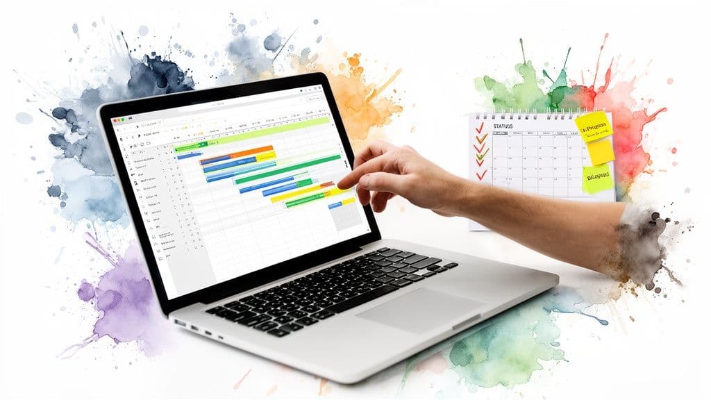
Automating Your Workflow with Modern Gantt Chart Tools
If you've ever built a Gantt chart in a spreadsheet, you know the satisfaction of laying out a perfect plan. You also know the pain that comes the moment something changes. Manually updating every single dependent task is tedious and prone to error.
This is where modern project management software completely changes the game. It takes the solid principles of a Gantt chart and turns it from a static picture into a living, breathing timeline for your project.
What’s the biggest difference? Automation. Imagine the design team needs an extra day to finalize UI mockups. Instead of you scrambling to adjust every subsequent deadline, the software does it instantly. The start date for "Begin Frontend Development" automatically shifts, along with every other task linked to it. Your timeline stays accurate without you lifting a finger.
More Than a Chart: A Central Hub for Your Team
Modern platforms also understand that a Gantt chart isn't the only way to look at a project. They transform your plan from a simple reporting document into a true command center with views for everyone.
Your development team might live in a Kanban board to manage their sprints, while your executives just want a high-level list of key milestones. A good tool lets everyone work from their preferred view, all pulling from the same central data. This eliminates confusion and ensures everyone is on the same page, no matter how they visualize their work.
When you're evaluating tools, these are the features that really make a difference:
- Automatic Rescheduling: When one task shifts, all its dependencies automatically adjust. This is non-negotiable.
- Progress-Based Updates: The chart updates task completion in real-time as team members complete their work, giving you a live look at progress.
- Resource Management: You get instant alerts when a team member is over-allocated, which helps you spot potential burnout and balance workloads proactively.
The goal of a modern Gantt chart isn't just to show you the plan; it's to help you execute it. It becomes your project's central nervous system, intelligently responding to changes as they happen.
This frees you up from being a "schedule secretary" and lets you focus on what really matters: making strategic decisions, clearing roadblocks, and supporting your team. For a deeper dive into how this works in practice, you can explore more on the topic of automated project management.
Finding the Right Tool for Your Industry
For some fields, general-purpose software isn’t quite enough. Industries like construction, for instance, have very specific needs that are better served by dedicated tools.
Specialized platforms like construction project management software often come with built-in templates, compliance checks, and workflows that generic tools simply can't match.
Ultimately, moving to a modern tool is a mindset shift. You’re no longer just creating a static Gantt chart. You’re building an automated system that manages the project's flow, letting your team spend less time updating schedules and more time doing the work that moves the needle.
Keeping Your Gantt Chart Relevant and Useful
I've seen it happen a thousand times: a team spends days meticulously building the perfect Gantt chart, only to let it gather dust in a shared drive. They treat it like a final exam they passed and then forgot about. But a Gantt chart's real value isn't in its creation; it's in its constant, active use as a living document that maps the messy reality of a project.
Your chart has one primary job: to be the single source of truth for your project’s schedule. When it’s up to date, it kills confusion and stops miscommunications in their tracks. When it's stale, it actively creates them. Think of it as a compass, not a museum piece.
Establish a Regular Update Rhythm
To prevent your beautiful chart from becoming a useless relic, you need a routine. For most of the projects I’ve managed, a weekly review hits the sweet spot. It's frequent enough to catch problems before they spiral but not so often that it becomes a chore.
This review meeting has one simple goal: make the chart match reality. Here’s what that looks like in practice:
- Update Task Statuses: Get in there and mark tasks as "In Progress," "Completed," or "Blocked." This instantly gives you a visual pulse on the project's health.
- Adjust Timelines: Did a task wrap up a day early? Fantastic. Pull the next dependent task forward. Did something get delayed? Don't hide from it. Push out the affected tasks and see the true impact on your end date.
- Log Changes: Add a quick note explaining why a date moved. This context is gold for your project post-mortems and for explaining any schedule shifts to stakeholders.
This whole process shouldn't take hours. In a modern tool like Fluidwave, updating one task can automatically ripple through the entire schedule, turning what used to be a manual nightmare into a quick, insightful check-in. If you want more ideas on this, we've written a whole guide on tracking project progress effectively.
An out-of-date Gantt chart is worse than no chart at all. It creates a false sense of security and leads to decisions based on bad information.
Communicate Changes Proactively
Once your chart is updated, it becomes your most powerful communication tool. The next time a stakeholder asks, "So, are we on track?" you don't have to give them a vague answer. You can show them the Gantt chart. It’s a data-backed report, not an opinion.
If a deadline is in jeopardy, the chart lets you show, not just tell, them why. You can point directly to the initial blocker and the domino effect it had on every task that followed. This immediately changes the conversation from one of blame to one of collaborative problem-solving. Suddenly, you're discussing real trade-offs—like adding resources or trimming scope—with a clear visual of the consequences.
One last piece of advice: resist the urge to cram every tiny detail into your chart. Stick to the core tasks and major milestones. A cluttered chart is a pain to read and even worse to maintain. By building these simple habits, you ensure your Gantt chart remains a trusted guide from kickoff to launch, not just a pretty picture of what you thought would happen.
Common Questions About Creating Gantt Charts
Once you start building Gantt charts, a few questions always seem to pop up. It's a fantastic tool, but some of the finer points can be tricky when you're just getting started. Let's tackle some of the most common ones I hear from teams.
What Is the Difference Between a Gantt Chart and a Project Timeline?
This one comes up a lot because they look so similar at first glance. Think of a project timeline as the high-level overview—it shows you the major phases, key milestones, and the overall schedule. It’s the "what" and the "when" in broad strokes.
A Gantt chart, however, drills down into the how. It’s not just a list of tasks on a calendar; its real power is in showing the dependencies between those tasks. You can instantly see that Task B can't start until Task A is finished. That's the magic. A timeline shows the sequence, but a Gantt chart shows the interconnected system that makes your project work.
How Do I Choose the Right Tool for Making a Gantt Chart?
The tool you choose should match the complexity of your project. For something incredibly simple—maybe a personal project with a dozen tasks—you might get by with a spreadsheet template from Excel or Google Sheets. But be warned: they're static and become a nightmare to update manually the moment anything changes.
The most common mistake is choosing a tool that's either too simple or too complex. A static spreadsheet creates a ton of manual work on a real project, while a massive enterprise tool will just bog down a small team.
For any serious project, you'll want dedicated project management software. Look for a platform with dynamic Gantt charts that let you:
- Drag and drop tasks to instantly change dates.
- Create dependencies between tasks with a simple click.
- Automatically adjust the entire schedule when one task slips.
When a tool can do this, your Gantt chart transforms from a picture into an active, intelligent part of your workflow.
What Are the Most Common Mistakes to Avoid?
I’ve seen a few classic pitfalls trip up even experienced managers. If you can sidestep these, you're already ahead of the game.
The first is simply being too optimistic with timelines. Always build in a buffer. The best way to get realistic estimates is to go talk to the people who will actually be doing the work.
Another major one is forgetting to set dependencies. Without those crucial links, your chart isn't a project management tool—it's just a pretty bar chart. You lose the ability to see the ripple effect of a single delay.
Finally, you have to fight the urge to "set it and forget it." A Gantt chart is a living document. If it doesn't reflect what’s actually happening on the ground, it’s worse than useless; it’s misleading. A quick weekly review and update should be the absolute minimum.
Can I Use a Gantt Chart for Agile Projects?
Absolutely, though it requires a slight shift in thinking. Gantt charts have a reputation for being tied to traditional Waterfall projects, where every single step is planned out from the very beginning.
But they can be incredibly useful in an Agile framework. Instead of mapping out the entire year-long project, you use a Gantt chart to visualize a single sprint. It helps the team see dependencies and manage workloads within that two-week sprint, tracking progress toward a specific sprint goal. It’s a hybrid approach that gives you the visual clarity of a Gantt chart within the flexible, iterative world of Agile.
Ready to move beyond static spreadsheets and build dynamic, intelligent timelines? Fluidwave combines powerful Gantt chart features with AI-driven automation and delegation. Stop just planning your work—start automating it. Discover how you can create smarter project plans and reclaim your time at https://fluidwave.com.
Focus on What Matters.
Experience lightning-fast task management with AI-powered workflows. Our automation helps busy professionals save 4+ hours weekly.