Learn how visual task management boosts focus, clarity, and team collaboration. Compare Kanban, calendar, and card views with practical tips.
October 6, 2026 (1d ago)
Visual Task Management for Focus and Flow
Learn how visual task management boosts focus, clarity, and team collaboration. Compare Kanban, calendar, and card views with practical tips.
← Back to blog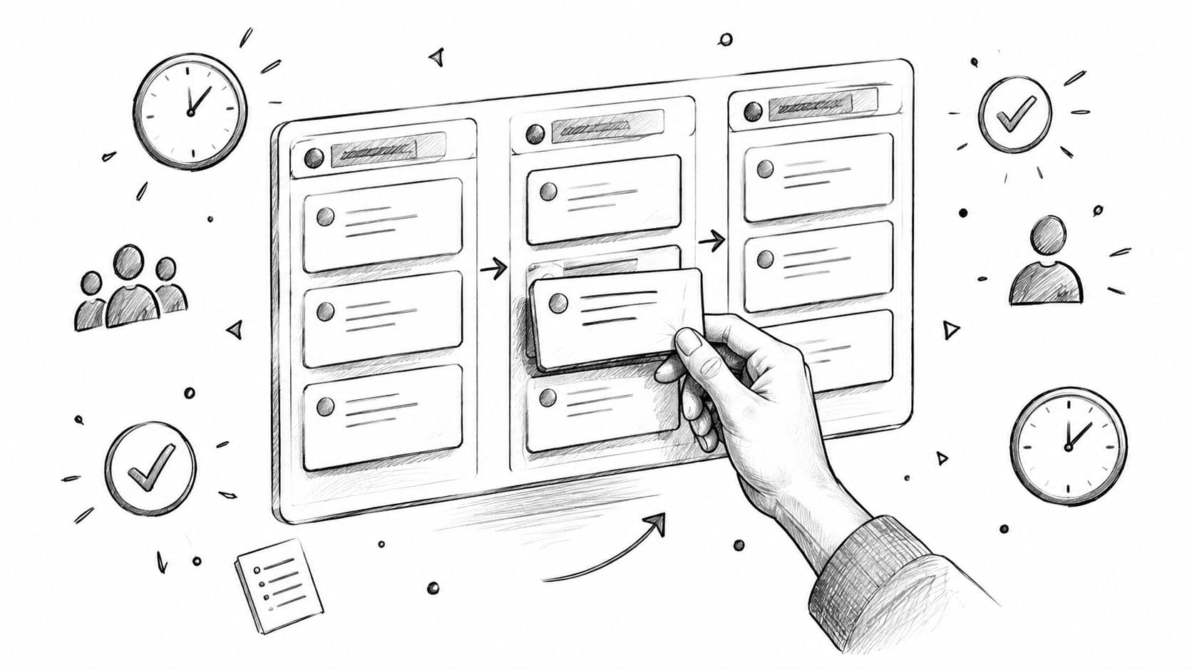
You wake up to a 47-item task list. The first few items look urgent, the rest disappear beneath a wall of text. Before breakfast, you've bounced between three chat threads, two documents, and a spreadsheet you forgot existed. By late morning, you've worked on plenty of things, but you can't point to much that's finished.
That pattern isn't laziness. It's a visibility problem. A text list hides priority, ownership, blockers, dependencies, and completed work. Visual task management addresses the problem by moving work out of your head and onto a layout where the next action and current status are easier to see.
When Your To-Do List Stops Working
A checklist answers a narrow question: is this task checked or unchecked? That's useful for simple errands, but it becomes fragile when work moves through several stages. “Prepare launch brief” might be waiting for research, under review by a manager, or ready for publishing. A checkbox treats those states as identical until the task is complete.
The result is a familiar Monday morning loop. You open the list, skip everything that doesn't feel urgent, respond to the newest message, and then try to reconstruct what matters from memory. Each interruption forces you to recover context that the list never displayed in the first place.
The failure mode is invisibility, not a lack of effort.
A visual board makes the hidden parts of work visible. A card can show its owner, due date, priority, blocker, and current stage. Its position can tell you whether it's waiting to start, actively moving, paused for someone else, or finished. You don't need to remember the entire workflow before deciding what to do next.
The cognitive case is stronger than the aesthetic one. Controlled experiments described by the American Psychological Association's research on multitasking found that people became slower when switching between tasks, even when the switch was predictable. Psychologist David Meyer estimated that brief mental blocks from switching can consume as much as 40% of productive time, while a Microsoft Research synthesis reported that workplace activities shifted approximately every 3 minutes on average and that switching attention produced a 50% longer completion time than focusing on one task until completion. Those figures vary by complexity, interruption frequency, and individual differences, but they point to a practical design principle: show the work so people don't have to rebuild its context repeatedly.
A useful system doesn't force every task into one view. It gives you a way to choose the right visual shape for the work. The four common options are Kanban boards, calendars, card galleries, and tables. Each answers a different operational question.
What Visual Task Management Actually Means
Start with a kitchen whiteboard. Each order is represented by a card. One area shows what the chef should cook next, another shows food currently being prepared, a pass area shows plates waiting to leave the kitchen, and a completed area shows orders already served.
The chef doesn't need to read every order from the beginning to understand its state. The card's location carries information. Moving it is also meaningful. It signals a deliberate transition from one operating condition to another.
Digital visual task management applies the same principle to knowledge work. It has three basic elements:
- A task is a discrete unit. “Improve marketing” is too broad to manage visually. “Draft landing-page headline options” gives the board something specific to assign, move, review, and complete.
- A view is a spatial container. Columns, rows, dates, lanes, and cards arrange tasks so people can compare them without opening every record.
- A status transition is deliberate. Moving a task from “Ready” to “In Progress” means someone has started it. Moving it to “Review” means the work needs a different kind of attention.
A checklist usually exposes only completion. A visual system can expose flow. It can show that five tasks are waiting for approval, one person owns nearly every active item, or a dependency is holding up an otherwise finished project.
The distinction matters because the board shouldn't become a decorated storage bin. Its layout needs to reflect how work moves. If a team's real process is intake, qualification, execution, review, and delivery, those states should appear in the system. If a freelancer mainly works from deadlines, a calendar may be more useful than a complex status board.
Visual cues also reduce the need to hold task relationships in working memory. Research on visual-based instructions found lower subjective cognitive load than code-based instructions in a controlled assembly study involving 30 participants, alongside shorter task-completion time and higher normalized task performance in the study published through PubMed Central. The lesson isn't that every board needs more color or decoration. It's that clear visual encoding can make sequence, status, and relationships easier to process.
Visual task management is the practice of placing discrete work items into a spatial workflow where status, ownership, and next action can be recognized rather than recalled.
Comparing the Main Visual Views
No visual layout is universally superior. The right choice depends on the question you need the workspace to answer.
Kanban boards
Kanban uses columns to represent workflow states. A content team might use Ideas, Drafting, Editing, Approved, and Published. A service team might use New, Investigating, Waiting for Customer, and Resolved.
This view is strong when you need to see movement, limit work in progress, and identify blockers. It's weaker when dates drive the work. A board can show that ten tasks are in progress, but it won't automatically show that three deadlines collide on Thursday.
Calendars
A calendar puts time on the main axis. It works well for deadlines, meetings, publishing schedules, appointments, and weekly capacity planning. You can immediately see whether a supposedly light week is crowded with commitments.
The tradeoff is that many tasks don't have reliable dates. Research, maintenance, internal improvements, and waiting work can sit awkwardly on a calendar because their timing changes.
Card or gallery views
A card gallery uses rich tiles with images, tags, owners, or short previews. Designers can review creative concepts, editors can scan article drafts, and marketers can compare campaign assets without opening each item.
This view supports context and visual recognition, but it's weaker for throughput analysis. A gallery can make work understandable without making flow measurable.
Tables
Tables organize information into dense rows and columns. They're practical for sorting, filtering, bulk editing, audits, and reporting. If you need to find every overdue task owned by one department, a table may be faster than a board.
The weakness is spatial reasoning. Rows don't communicate workflow movement as naturally as columns, and a dense table can recreate the very reading burden that visual task management is meant to reduce.
| Visual Task Views Compared | Best For | Weakness |
|---|---|---|
| Kanban | Workflow stages, blockers, work-in-progress | Less effective for date-driven planning |
| Calendar | Deadlines, meetings, weekly scheduling | Loose or back-of-house work can feel forced |
| Cards or gallery | Creative reviews, content, rich context | Weak for throughput and flow metrics |
| Table | Filtering, reporting, bulk edits | Less intuitive for spatial workflow reasoning |
A practical rule is to match the view to the task type. Use a Kanban board for operational flow, a calendar for time commitments, cards for creative context, and a table for administration. You don't need to make one layout carry every kind of work.
Why Seeing Your Work Changes How You Focus
Recognition is easier than recall. When a board places a task in a clear Review column, you recognize its state instead of remembering what “review” meant from a long sentence in a list. The eye can scan position, grouping, labels, and visual emphasis before you decide which task deserves closer attention.
A review of psychophysical research reports that people typically make three to four eye movements per second, with each fixation lasting a few hundred milliseconds. The same review describes visual sequences in which each image appeared for about 100 milliseconds in research summarized by PubMed Central. That doesn't mean users understand a complete task instantly. It does explain why concise titles, consistent columns, and stable visual cues help people scan the overall state of work.
Research on human visual-cortex signals also found that object-category information could be decoded as early as about 100 milliseconds after a stimulus appeared, with visual information reaching higher processing stages in less than 200 milliseconds according to the intracranial-recording study summarized in PubMed Central. For a task board, the narrow implication is useful: stable position, labels, icons, and restrained color can help users identify categories before they open and interpret the details.
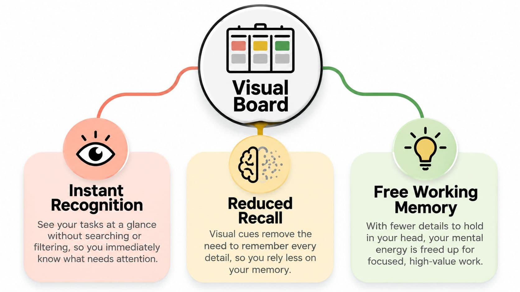
Design choices should serve that scanning behavior:
- Columns should represent real workflow stages, not vague labels that everyone interprets differently.
- Color should reinforce status or priority, while written labels explain what action is required.
- Avatars and owner names should clarify responsibility, especially when several people touch the same project.
- Dependencies should be explicit, so a blocked card doesn't look like ordinary waiting work.
The American Psychological Association also describes research involving 260 middle-school, high-school, and university students who were asked to study for 15 minutes at home. They studied for less than six minutes on average before switching tasks, with phones, email, instant messages, and deliberate device checks among the reported triggers in the APA's productivity coverage. The participants were students, so the average shouldn't be generalized to every workplace. The design lesson still applies: a board should help someone select one next action, while quiet views and notification controls protect that choice.
For professionals who want a deeper treatment of reducing interruptions and protecting attention, this guide to deep focus offers a useful companion. Visual task management is especially valuable for people juggling interruptions, designers managing parallel creative threads, and neurodivergent teammates who benefit from externalized state.
ADHD users may gain clarity from a board, but a board can also become a wall of competing signals. Accessibility research notes that people with ADHD may be particularly susceptible to cognitive overload and can benefit from grouping related items, reducing simultaneously visible information, and presenting work sequentially. A 2025 exploratory pilot involving 15 university students with ADHD associated spatial visualization and generative-AI simplification with improved task salience, planning support, and lower perceived cognitive load, although the improvements weren't statistically significant because of the small sample as reported in the accessibility research.
Seeing work isn't automatically helpful. Seeing the right amount of structured work can act as a cognitive accommodation built into the workspace.
Designing Boards That Reduce Cognitive Load
A richer board isn't automatically a better board. A stalled workspace often has forty tags, six custom fields, two overlapping automations, and three people who are afraid to change anything because they don't know what the changes will trigger.
That kind of system shifts effort from doing the work to interpreting the interface. Accessibility-aware design starts by reducing the number of decisions a person must make before acting.
Start with a quiet card surface
Keep the default card view limited to three visible fields: assignee, due date, and one priority marker. Put descriptions, files, comments, and secondary metadata inside the task. Users should be able to scan the board without losing important detail, but they shouldn't need to decode every field before choosing a next action.
Replace freeform tags with a controlled vocabulary tied to departments or work types. “Marketing,” “Finance,” and “Client request” are easier to maintain than dozens of personal labels that overlap in meaning.
Use saturation sparingly. Color should signal status or priority, not decorate every card. Pair each color with text or an icon because color alone doesn't explain the action required and can exclude people with color-vision differences.
Give movement a clear meaning
Archive completed work on a weekly cadence. A board full of old successes makes current work harder to find, especially for people who already struggle with visual overload.
Define “done” for every active column. “Editing” might mean the draft has a complete structure and needs line editing. “Ready to publish” might mean the owner, links, images, and approval are all present. A card should move because it meets a condition, not because someone wants the board to look active.
| Clutter Reduction Framework at a Glance | Visible Outcome |
|---|---|
| Limit cards to three key fields | Faster scanning and fewer competing cues |
| Use controlled labels | More consistent filtering and grouping |
| Reserve strong color for status or priority | Exceptions stand out without visual noise |
| Archive completed work weekly | The active surface stays current |
| Define “done” for each column | Card movement communicates real progress |
A board should feel more like a calm workbench than an operations dashboard. If someone with ADHD needs to see only the next few actions, offer progressive disclosure, a one-task focus mode, reduced animation, and urgency cues that don't depend only on color. If a table communicates the work more clearly than a board, use the table.
A useful visual system removes decisions from the screen so people can spend those decisions on the work.
For a practical look at how a task workspace can combine status, planning, and overview information, see this task management dashboard guide. The principle is simple: add a field only when someone will use it to decide, coordinate, filter, or act.
WIP Limits, Flow, and Smart Prioritization
A work-in-progress limit, or WIP limit, sets the maximum number of active items allowed in a workflow stage. If the In Progress column allows three cards, a fourth waits until someone finishes, delegates, or removes an existing item. The rule protects attention in the same way a narrow checkout queue prevents too many customers from crowding one counter.
Kanban University defines WIP as the number of work items currently in progress. Limits may apply to columns, swimlanes, people, work types, or the full system in its Kanban glossary. These limits support a pull system. When downstream capacity opens, someone pulls the next item. Managers do not keep pushing work into a stage that is already full.
A crowded queue signals a bottleneck, not productivity. Little's Law connects average lead time with average WIP and throughput. A quantitative case study of more than 8,000 work items across five software teams found that lower WIP was associated with shorter lead times, while its findings did not support a universal rule that lower WIP is always better in the SINTEF case study.
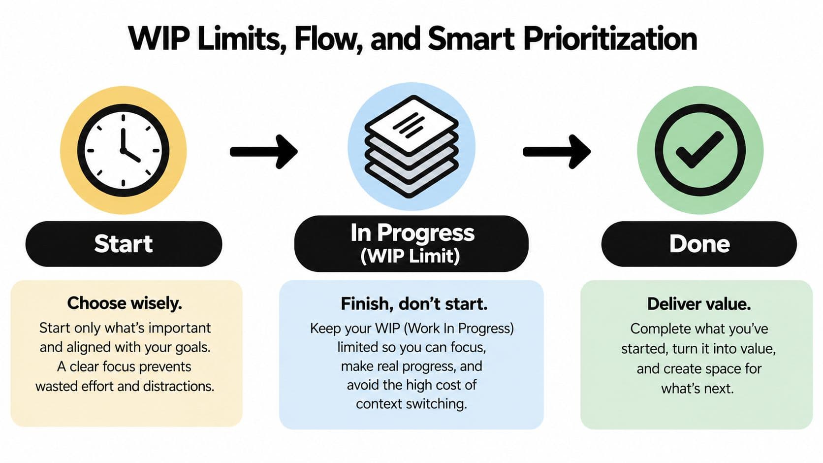
Use cycle time, throughput, blocked time, and aging work to test whether a limit fits. A simple operating loop is:
- Set a starting cap by stage. Three active items per column can be a useful experiment for a small workflow, not a universal law.
- Pull instead of push. Start work only when capacity exists or an explicit exception has been approved.
- Expose blocked work. Give a blocked card a visible state, an owner, and a next intervention.
- Review the evidence. Adjust the cap when people lack work, bottlenecks remain, or tasks age without movement.
For someone with ADHD or another neurodivergent working style, a visible cap can reduce the pressure to hold every request in working memory. It also makes a priority tradeoff concrete. The board shows which item must move before another can enter, rather than asking the person to remember an invisible rule.
AI prioritization can support this process without replacing human judgment. A system may rank tasks by urgency, importance, due dates, dependencies, or completion patterns. It may also flag stale items that the team has stopped touching. Treat those suggestions as triage, not as commands.
A responsible daily loop stays short: the system proposes a ranked focus list, the user reviews it, overrides items when context matters, and confirms the plan. Sensitive work, personal constraints, client promises, and wellbeing concerns should remain visible to the decision-maker instead of disappearing inside an opaque score.
The OECD's 2025 survey across France, Germany, Italy, Japan, Spain, and the United States found that 64% of managers using algorithmic-management tools observed at least one risk. Around two-thirds reported trustworthiness concerns, and 27% believed workers' physical and mental health were inadequately protected in the OECD report.
For a deeper treatment of caps and pull flow, see our guide to work-in-progress limits. For a plain-language introduction to WIP, pull flow, and bottlenecks, this Kanban method overview is a useful resource. WIP caps narrow attention, pull flow exposes capacity, and explainable AI can reduce triage while keeping accountability with the person doing the work.
Applying This in Fluidwave
Start with intake, not with a polished board. Create a Kanban intake column where raw requests land before they compete for active capacity. A request might come from a colleague, a client, or your own notes. Give it a clear title, one owner, a due date when one exists, and a short next action.
Fluidwave supports multiple visual views, including Kanban, calendar, cards, tables, and lists. The same work can be inspected from different angles without creating duplicate tasks. Use the Kanban view to understand flow, then switch to Calendar view to expose deadline collisions before they become delivery problems.
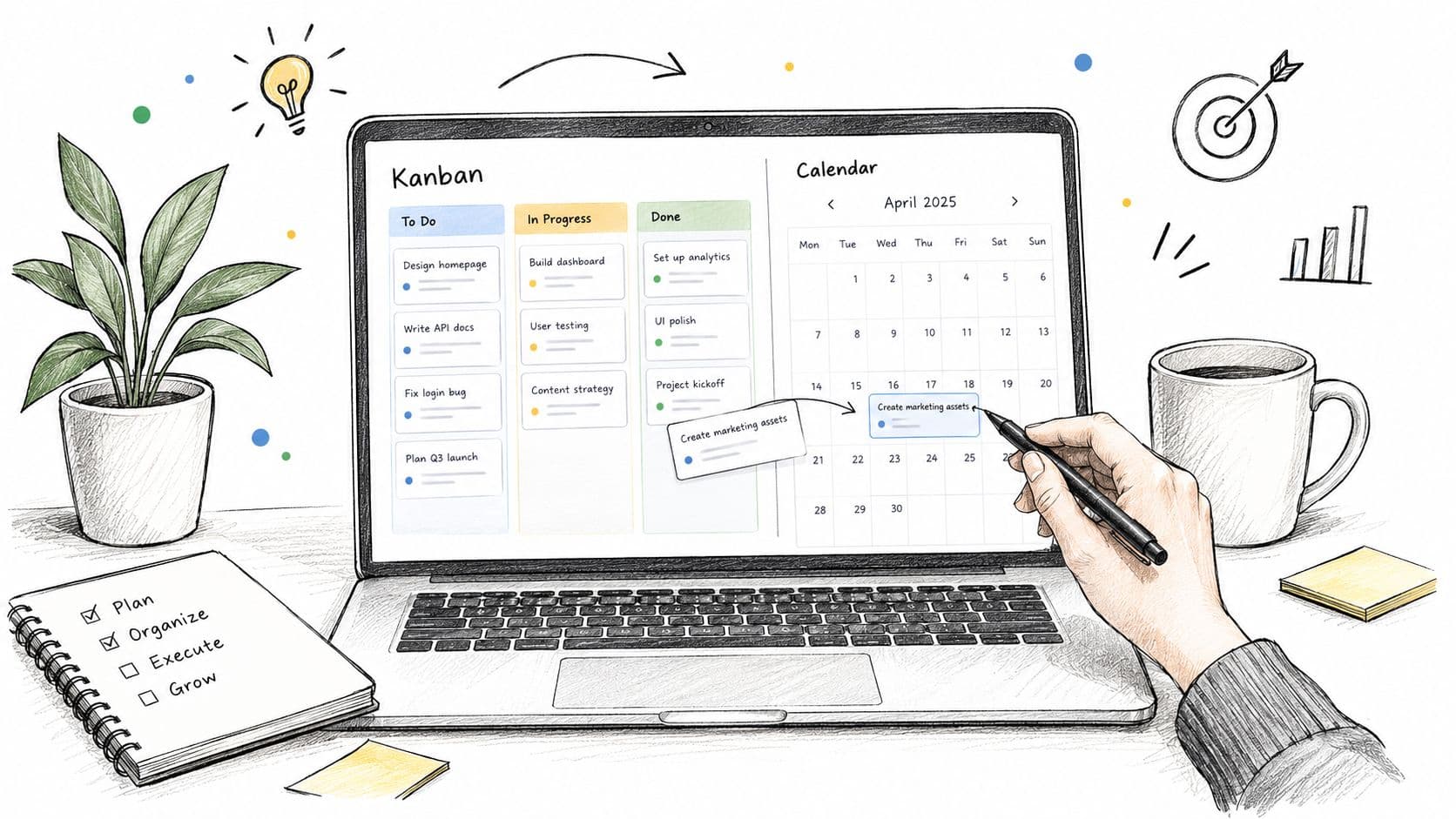
Suppose a marketing team receives requests for a landing-page update, a customer email, and a sales deck. The board might use Intake, Ready, In Progress, Review, and Done. Calendar view may reveal that all three deadlines fall close together. Card view can then surface the brief, reference files, owner, and comments for the creative work, while Table view can support sprint reporting, filtering, and bulk edits.
Set a WIP limit of three items per column as a starting operating experiment. Don't drag a fourth card into In Progress because the request feels important. Pull the next card only when someone has capacity, and mark a task as blocked when another person, decision, or dependency is holding it.
The platform's AI prioritization can rank work by impact and due date, but keep the override visible. Ask it for a daily focus list, inspect why the order changed, adjust the sequence when client context or personal constraints demand it, and confirm the final plan yourself.
A short standup can run directly from the board:
- What moved? Scan cards that changed columns since the last review.
- What's blocked? Open only cards with an explicit blocked state.
- What needs a decision? Review owner, dependency, and due date.
- What can enter next? Pull work only into columns with available capacity.
This approach also helps teams that are trying to streamline workflow for service businesses, because intake, ownership, deadlines, and handoffs remain visible in one operating view. A solo professional can use the same structure with fewer columns, while a shared team can keep coordination inside the board rather than moving between chat, documents, and separate status reports.
The important part isn't using every view. It's giving each view one job. Kanban shows movement, Calendar shows time pressure, Cards show context, and Table shows structured control.
A Practical Checklist You Can Reuse
Use this baseline in any visual task system for two sprints before changing the rules. The aim isn't to create a perfect process. It's to make attention, ownership, and unfinished work visible enough to improve the process.
- Externalize every commitment. Capture requests instead of trusting memory.
- Choose one view per workflow stage. Give each layout a clear job.
- Color-code by status, not decoration. Make exceptions easy to recognize.
- Set a WIP limit per column. Protect capacity and expose bottlenecks.
- Define “Done.” Make movement meaningful rather than cosmetic.
- Review the board daily. Select a small number of next actions.
- Limit active tasks. Reduce context switching and unfinished work.
- Visualize blockers. Name the dependency and the person who can clear it.
- Update regularly. A stale board creates false confidence.
- Simplify columns monthly. Remove stages, fields, and labels nobody uses.
Turn off non-essential notifications so your visual workspace doesn't become another interruption channel. Schedule a Friday review to archive completed work, inspect aging tasks, and adjust limits. Revisit the layout monthly, especially if ADHD users or other neurodivergent teammates report that the board feels crowded rather than clarifying.
Start with less information than you think you need, then add only what improves a real decision.
The best system is the one people can read, trust, and maintain during a busy week. Run the checklist long enough to observe your actual working tempo, then change thresholds and rules based on where work stalls.
Fluidwave combines Kanban, calendar, table, list, and card views with AI-assisted prioritization, so you can organize work visually while keeping a person responsible for final decisions. Visit Fluidwave to create a clearer intake-to-completion workflow and give your next action a visible place to start.
Focus on What Matters.
Experience lightning-fast task management with AI-powered workflows. Our automation helps busy professionals save 4+ hours weekly.