Unlock peak productivity with our guide to color code notes. Learn to build a visual system that clarifies tasks, boosts focus, and saves you hours.
March 18, 2026 (3mo ago)
Master Your Workflow: How to Color Code Notes for Productivity
Unlock peak productivity with our guide to color code notes. Learn to build a visual system that clarifies tasks, boosts focus, and saves you hours.
← Back to blog
A simple way to start color-coding your notes is by assigning colors to a few core categories. Think priority, task type, and status. This one small change turns a wall of text into a scannable, actionable plan, letting you see what's important without rereading every line.
The Hidden Power of Visual Cues in Your Notes
Let’s face it: a huge block of black-and-white text is a motivation killer. Whether it’s meeting minutes, a project brief, or your daily to-do list, undifferentiated information forces your brain to work overtime just to figure out what actually matters.
This is where color-coding completely changes the game. You're not just decorating your notes; you're building a powerful system of visual shortcuts that cuts down on cognitive load. Instead of scanning line by line for that one urgent task, your brain instantly connects "red" with "urgent" or "blue" with "idea for later." It’s a simple mental shortcut that saves you a surprising amount of time and energy.
Why Visuals Work So Well
Our brains are wired to process images and colors far more quickly than text. By giving your colors specific jobs, you're tapping into this natural superpower, turning static notes into a dynamic productivity tool. It's a fantastic method for boosting memory and recall, too.
A 2022 study on color education revealed that 66% of medical students found color-coding highly effective for memory retention—outperforming rote memorization by a long shot. The visual approach proved to be over three times more effective than just learning by heart.
By creating a consistent color language, you build an intuitive system that your brain can process at a glance, turning chaos into clarity and saving hours of review time each week.
This Kanban board is a perfect example. Color instantly flags the type of task you're looking at.

Here, the colors act as an immediate filter, letting you gauge your project's status without having to read a single task title. While incredibly powerful, color-coding is just one of many different note-taking methods you can use to sharpen your focus and get organized.
Building a Color Code System That Actually Works
Let's be honest: a random splash of color isn't organization, it's just noise. I’ve seen countless people create a “rainbow catastrophe” where everything is highlighted, but nothing actually stands out. An effective color system needs rules—your rules.
The goal is to build a consistent, personal framework that your brain can process in a split second. The biggest mistake you can make is picking pretty colors first. Before you even think about a single hex code, you need to decide what your colors will mean.
Define Your Color Categories
So, what are the most important ways you need to slice and dice your information? This is where you move beyond generic advice and build a system that clicks with how you think and work.
Most people find success by starting with a few core categories. Here are some of the most effective starting points I’ve seen:
- By Priority: This one’s a classic for a reason. Red for urgent, yellow for important-but-not-urgent, and green for low-priority tasks. It’s simple and universally understood.
- By Task Type: Are you doing deep work, answering quick emails, or jumping on a call? Assigning a color to the type of work helps you batch similar tasks and manage your energy. For instance, all my "deep work" tasks are a specific shade of blue.
- By Project or Client: If you’re juggling multiple projects, giving each a unique color (e.g., Project Alpha is purple, Project Beta is orange) gives you an immediate visual summary of your entire workload.
- By Context: This is fantastic for separating different areas of your life. You could use one color for work notes, another for personal tasks, and a third for that side hustle you're building.
The key is to pick categories that genuinely simplify how you make decisions. Start small—no more than three or four—to keep things from getting overwhelming. You can always add more later.
Choose a Simple and Functional Palette
Once your categories are locked in, now you can pick your colors. Remember, the goal here is clarity, not just aesthetics. A limited palette of 3-5 distinct colors is almost always more effective than a dozen similar shades. It prevents decision fatigue and makes your system much easier to remember.
When I first started, I used a different color for everything, and it was a complete mess. Now, I stick to four primary colors that mean the same thing everywhere—from my Fluidwave dashboard to my physical notebook.
Research backs this up. A 2022 study found that 66% of medical students found color-coding superior to rote memorization—a finding that’s incredibly relevant for ADHD and neurodivergent minds. Practical systems often suggest red for urgent action items and blue for key decisions, which can reportedly boost organization by as much as 50%. You can learn more about how color-coding helps with focus on the Sachs Center's website.
The best color code system is the one you don't have to think about. It should be so ingrained that seeing a color instantly triggers the right context in your mind.
Keep it simple. Keep it consistent. Give every color a clear job. This foundation is what turns your notes from a passive archive into an active tool for getting things done.
Applying Your Colors Across Different Project Views
Creating a color system is one thing; seeing it work for you across your entire workflow is where the real magic happens. The whole point is to make your color-coded notes so instinctive that you can grasp a project's status in a heartbeat, no matter which view you're in. Consistency is everything—it's what turns a nice-to-have feature into your most powerful organizational asset.
When your system is applied everywhere, the colors do the heavy lifting. That red "Urgent" task isn't just an item on a list. It pops on your weekly calendar, stands out in a crowded table, and practically screams for attention on a Kanban card. This ensures the truly critical stuff never gets lost in the noise.
Bringing Your Color System to Life
In a flexible tool like Fluidwave, your colors are designed to travel with your tasks, giving you immediate context everywhere you look. This is how your system goes from a static set of rules to an active guide that helps you make better decisions on the fly.
- Kanban View: This is a classic. Colors are perfect for showing task type or project stream. Picture a board where all marketing tasks are green and all development tasks are blue. You can instantly spot bottlenecks or see if one team is getting overloaded.
- Calendar View: For a calendar, colors are fantastic for showing priority or context. Maybe all your hard deadlines are red, while internal meetings are gray and personal appointments are yellow. It gives you a visual map of your week's commitments without having to read a thing.
- Table View: When you're staring at a spreadsheet-style view packed with data, colors can highlight task status. A quick scan tells you what's in progress (yellow), what’s done (green), and what’s blocked (red), making project tracking far less of a chore.
This flowchart breaks down how a few core categories like priority, task type, and context can form the backbone of a simple but incredibly effective system.
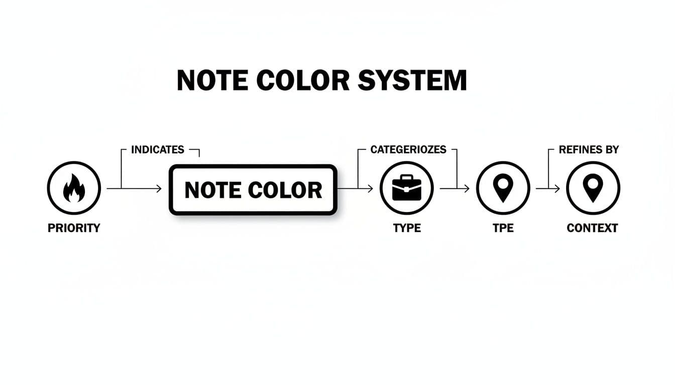
It’s all about layering information without creating visual chaos. The goal is to make your notes instantly scannable and understandable.
From Individual Tasks to the Big Picture
Ultimately, applying colors with discipline lets you zoom in on the details and zoom out to see the 30,000-foot view with total clarity. At a micro level, you can find a specific task in seconds. But at the macro level, you can assess the health of an entire project just by the blend of colors you see.
For example, seeing a sea of red and yellow cards piling up in the "In Progress" column of your board is an immediate warning sign. It tells a story of overload or hidden roadblocks before you even have to read a single task description. This is the kind of insight that helps you manage workflows effectively, which you can read more about in our guide to using a Kanban board for project management.
The real breakthrough happens when the color system becomes second nature. It should feel less like a chore and more like an intuitive language that guides your focus and cuts through the complexity of your projects.
This consistency is what frees up your mental energy. You spend less time on administrative check-ins and more time focusing on the work that actually matters.
Designing for Accessibility and Neurodiversity
A great color-coding system should bring clarity to everyone on your team, not put up new walls. When we color code notes, the goal is to make information easier to digest at a glance. But if color is the only thing you’re relying on, you might accidentally leave people out. A truly powerful system is one that’s inclusive from the ground up.
Let's start with contrast. It's a bigger deal than you might think, as around 1 in 12 men and 1 in 200 women have some form of color vision deficiency. By picking a palette with high-contrast colors, you're making sure the distinctions between "urgent" and "in-progress" are clear, even for those who see color differently.
Beyond Color Alone: Using Multiple Cues
High contrast is a great first step, but the real secret to an inclusive system is to never let color do all the heavy lifting by itself. This is where you can start layering your visual cues to add meaning.
Think of it this way: instead of just making a top-priority task red, you can also:
- Add an icon that signals urgency, like a fire or warning symbol.
- Use a text label like "[High Priority]" or a "#P1" tag.
- Apply formatting, such as making the task title bold.
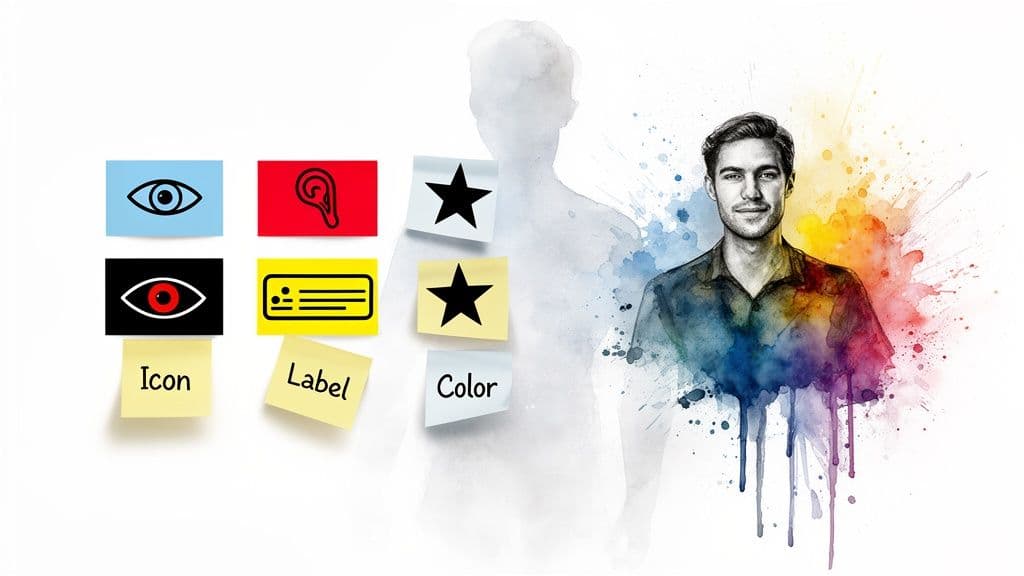
This layering of information makes your system incredibly robust. It ensures that everyone, regardless of how they perceive color, can instantly grasp what’s important.
Supporting Neurodivergent Brains
This multi-layered approach is also a game-changer for neurodivergent folks, especially those with ADHD. When you provide multiple visual signals, you reduce the cognitive load needed to interpret the information, making it much easier to focus on what matters.
A system with clear, consistent symbols and labels avoids that overwhelming "rainbow catastrophe" where everything is colorful but nothing is clear. It’s about creating predictable patterns that the brain can latch onto, which is a core principle of ADHD-friendly design.
An inclusive system isn't about adding extra features for a few people; it's about building a better, clearer system for everyone. When you design for accessibility, you often create a more intuitive experience for your entire team.
In a tool like Fluidwave, this is easy to implement. You can pair a status color with a specific tag or assign an icon to a task type. By thinking about accessibility from the very beginning, you end up with a workflow that genuinely helps everyone stay organized and on track.
For more strategies on this, check out our guide on ADHD organization tips that actually work.
Putting Your Color Code System on Autopilot
A great system shouldn't require constant upkeep. The whole point is to spend less time organizing and more time on the work that actually matters. While manually applying colors to your notes and tasks is a good start, the real magic happens when the process becomes completely invisible. That’s where automation comes in—it takes your carefully designed system and puts it on autopilot.
By setting up a few simple rules, you can eliminate the manual drag-and-drop entirely. This doesn't just save you a few clicks here and there; it guarantees your system stays perfectly consistent, even when you're moving fast and don't have time to think about it.
How to Automate Your Color Coding
Inside a tool like Fluidwave, you can use built-in automations to create simple "if-then" rules that handle all the coloring for you. Think of it as teaching your digital workspace the rules you've already defined. Once taught, it applies them instantly and without fail, removing the risk of human error and making sure every item is categorized correctly from the moment it's created.
Here are a few real-world examples of rules you could build:
- By Keyword: Create a rule where any new task containing "report" or "summary" is automatically colored blue.
- By Priority: Set an automation to instantly color any task marked "High Priority" as red.
- By Assignee: If you assign a task to your virtual assistant, a rule can turn that task green so you can see what's been delegated at a glance.
- By Deadline: Any task with a due date in the next 24 hours could automatically switch to orange, signaling its urgency.
This is what it looks like to build one of these trigger-based automations right inside Fluidwave.
Each rule simply connects a trigger (like a keyword or a due date) to an action (like changing the color). This simple setup is the engine that will run your entire color-coded system for you. For a closer look at what’s possible, our guide on how to automate workflows explores more advanced strategies.
Automation is what makes a good system truly effortless. It bridges the gap between knowing how to organize and having an organized space, reclaiming hours lost to manual admin work each week.
Once your rules are in place, the system just works. A new task appears, Fluidwave's AI instantly checks its properties, and the correct color is applied in a split second. You get all the clarity of a perfectly organized workflow with zero ongoing effort.
Common Questions About How to Color Code Notes
Whenever you start a new organizing method, questions are bound to pop up. Learning to color-code your notes is no exception. Getting the basics right from day one is often what separates a system that actually sticks from one you'll abandon in a week.
So, let's walk through some of the most common questions people ask when they're first trying to build a color-coded workflow. Answering these will save you a lot of trial and error down the road.
How Many Colors Should I Use?
It's tempting to get ambitious and assign a color to every little thing, but that approach almost always backfires. My best advice? Keep it simple, especially when you're just starting out.
I’ve found the sweet spot, both for myself and for teams I've helped, is between 3 and 7 colors. Any fewer, and you won't have enough detail to make meaningful distinctions. Any more, and you risk creating a "rainbow catastrophe" where nothing stands out because everything stands out.
A solid foundation to build on is defining colors for three core areas:
- Priority: Instantly flags what needs your attention right now (e.g., Red for Urgent).
- Status: Shows you where a task is in your workflow (e.g., Green for Done).
- Task Type: Helps you batch similar work together (e.g., Blue for Deep Work).
You can always add more complexity later. Starting with a small, memorable palette makes the whole system much easier to learn and internalize. Remember, the goal is clarity, not just color.
What if Someone on My Team Is Colorblind?
This is a non-negotiable for any team. If your system relies only on color to communicate important information, you're guaranteed to leave some of your colleagues behind. The best and most inclusive practice is to treat color as a helpful secondary signal, not the only one.
I always build systems that pair colors with another clear indicator. For example, don't just make an urgent task red. Make it red and also add an "[Urgent]" text label, a fire emoji, or even just bold text. This approach ensures that vital information is accessible to everyone, no matter how they perceive color.
How Do I Get My Team on Board?
Getting a team to adopt a new system really comes down to two things: making it easy and making it collaborative. You can't just drop a new set of rules on everyone and expect them to follow along.
First, get your team involved in creating the system. When people have a voice in defining the rules, they feel a sense of ownership and are far more likely to stick with it.
Second, create a shared legend that’s dead simple to find. In a tool like Fluidwave, you could make this a pinned task or a doc in your project space that clearly explains what each color represents. Then, just lead by example and automate as much as you can to lighten the load for everyone.
When a system is easy to use and everyone helps build it, adoption happens naturally. The less friction there is, the faster it becomes a habit.
Should I Apply Colors During or After Note-Taking?
This is a great question that gets to the heart of how our brains actually process information. Based on my own experience and what we know about learning, applying colors after you capture your notes is far more effective for retention.
Think about it: during a meeting or a brainstorm, your main goal should be getting everything down. Don't interrupt your flow. But afterward, taking 5-10 minutes to go back through those raw notes and deliberately assign colors forces you to review and re-engage with the material. This simple act of review helps lock the information into your long-term memory.
Ready to build a color-coded system that practically runs itself? With Fluidwave, you can create powerful automations that apply your color rules instantly, keeping your work perfectly organized without the manual effort. Get started with Fluidwave for free and see how a smarter workflow can change the way you work.
Focus on What Matters.
Experience lightning-fast task management with AI-powered workflows. Our automation helps busy professionals save 4+ hours weekly.