Master color coding in Excel to transform messy data into a clear, actionable dashboard. Learn conditional formatting, custom formulas, and best practices.
July 20, 2026 (3mo ago)
Color Coding in Excel: A Guide to Visual Task Management
Master color coding in Excel to transform messy data into a clear, actionable dashboard. Learn conditional formatting, custom formulas, and best practices.
← Back to blog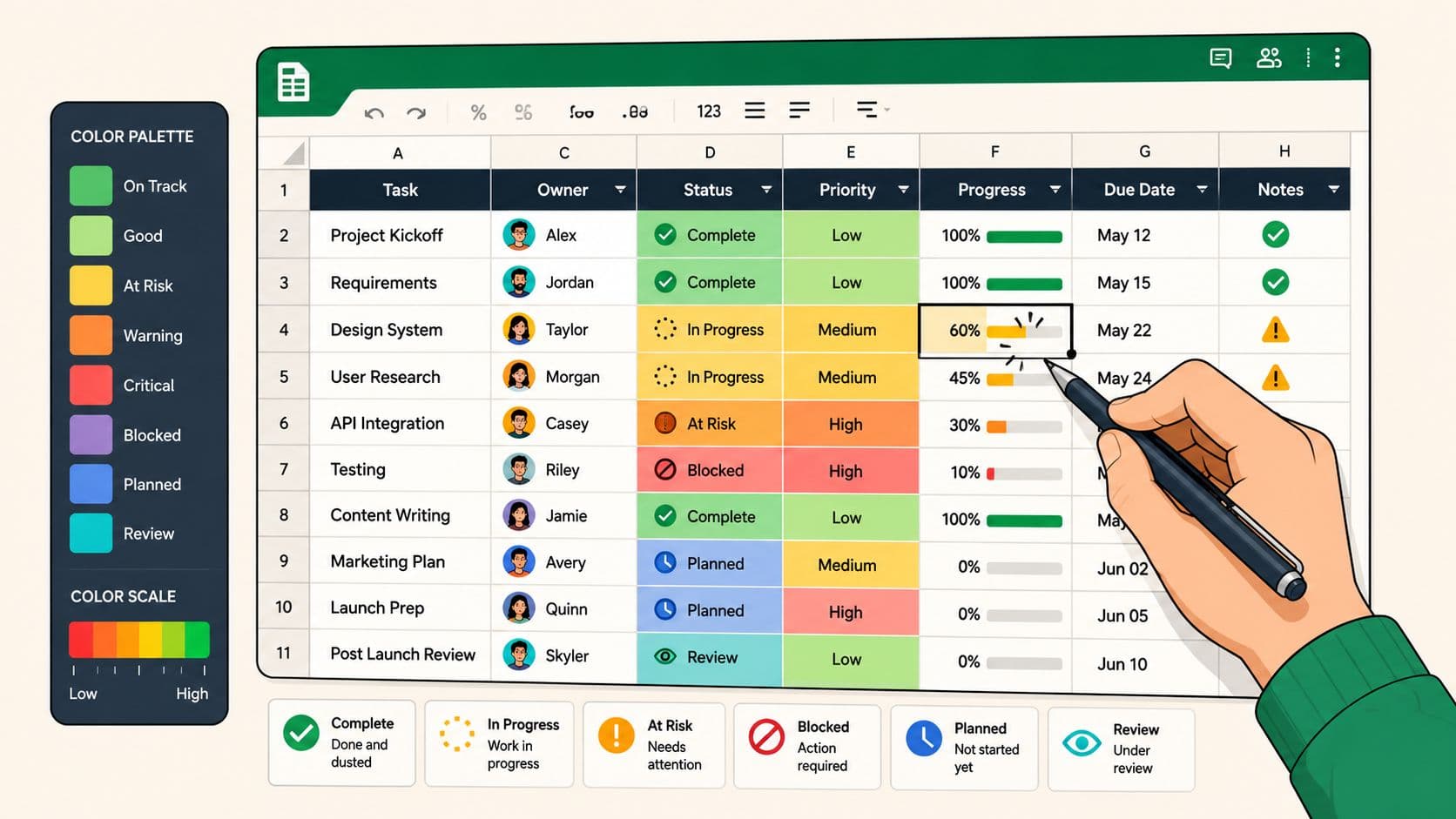
A lot of spreadsheets don't fail because the data is wrong. They fail because nobody can see what matters fast enough.
That usually shows up in familiar ways. A project tracker has twenty open items, but the overdue ones blend in with everything else. A budget sheet looks tidy until someone notices the cost overrun buried halfway down the page. A task list has statuses, owners, and dates, but every row asks the reader to stop, read, and interpret. That's slow work, and slow work creates missed signals.
Good color coding in Excel fixes that. Not by making a sheet prettier, but by turning it into something you can scan. For busy professionals, that difference matters. You don't need decorative formatting. You need visual triage.
Your Guide to Color Coding in Excel
Many begin using color in Excel the same way. They click a cell, choose a fill color, and move on. That works for one-off emphasis. It doesn't work as a system.
The value of color coding in Excel is that it helps you answer practical questions without rereading your sheet every time. What's overdue. What's blocked. What's over budget. What needs attention today. When a spreadsheet does that well, it stops being a passive record and starts acting like a working dashboard.
When simple color helps
Manual color still has a place. If you're preparing a presentation and need to highlight one approval date or one critical budget line, the basic Fill Color tool is fast and perfectly adequate. It's also useful in personal planning sheets where you're marking a few items by hand and the data won't keep changing.
That's the exception, not the rule.
Where most sheets break down
The minute your spreadsheet becomes operational, manual coloring starts causing trouble:
- It goes stale quickly when statuses, dates, or values change
- It depends on memory because someone has to remember what each color means
- It scales badly when your list grows beyond a small working range
- It creates inconsistency across teams, especially when multiple people edit the same file
Practical rule: If a color should change when the data changes, don't apply it manually.
That's why the strongest Excel setups rely on rules, not touch-ups. Use color to reduce thinking, not add another layer of it.
What makes a strong visual system
A useful color system in Excel does three things well:
| Purpose | What it looks like in practice |
|---|---|
| Signals urgency | overdue tasks, at-risk items, budget exceptions |
| Shows progress | completion trends, milestone movement, status shifts |
| Creates consistency | the same colors mean the same thing every time |
That's the standard to aim for. Not “colorful.” Clear.
Starting Simple with Manual Fill Colors
The manual method is basic, but it's worth understanding because people still use it every day. Select a cell or range, go to the Home tab, and click the Fill Color paint bucket. Pick your color, and Excel applies it instantly.
For a single meeting deck or a rough personal checklist, that can be enough. If I'm reviewing a draft project plan with a stakeholder and want to mark three rows for discussion, I'll often use manual fill on the spot. It's fast, obvious, and doesn't require setup.
Good uses for manual color
Manual fill works best when the spreadsheet is static or short-lived. A few examples:
- Presentation markup for one executive review
- Temporary review notes during a planning meeting
- Small personal lists where only you use the file
- Section labeling so separate blocks of a worksheet are easier to find
That kind of color is closer to a highlighter on paper. It helps in the moment.
Where it starts costing you time
The problems appear when people try to run active work through manual formatting. A task changes from “Waiting” to “Done,” but the color doesn't get updated. A budget line crosses a threshold, but nobody notices because the sheet still reflects last week's manual edits. One person uses yellow for caution. Another uses yellow for pending approval.
That's when color creates noise instead of clarity.
Manual fill is fine for emphasis. It's poor for monitoring.
A simple way to decide is to ask one question: Will this value change again? If the answer is yes, you want automation.
A quick comparison
| Method | Best for | Weakness |
|---|---|---|
| Manual Fill Color | one-off highlights, temporary review notes | static and easy to forget |
| Rule-based formatting | live trackers, budgets, status sheets | takes setup effort up front |
That setup effort pays for itself quickly. Once color starts responding to the data, you stop babysitting the spreadsheet.
Automate Your Insights with Conditional Formatting
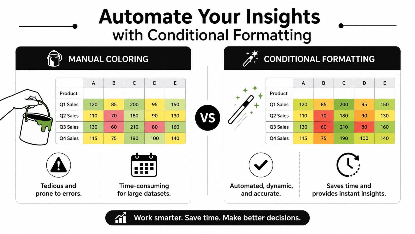
Color coding in Excel offers significant utility. Conditional Formatting is the feature that drives automated color coding. Microsoft identifies it as a core Excel functionality introduced in Excel 2007, and it lets you apply rules, highlight cells automatically, and use color scales that update as data changes. It can also trigger formats such as “Light Red Fill with Dark Red Text” for values greater than 10,000. Microsoft's documentation also notes that color scales can be built around number, percent, or percentile values for minimum, midpoint, and maximum settings in a range, which is why they adapt well to different kinds of datasets in Excel's conditional formatting guide.
A quick visual makes the difference obvious.
How to apply the core rule types
The basic path in Excel is consistent. Select your range, open the Home tab, go to the Styles group, click Conditional Formatting, and choose the rule type you need.
The most useful options for working professionals are:
- Highlight Cells Rules for direct thresholds
- Data Bars for visual progress inside cells
- Color Scales for spotting relative highs and lows
- Icon Sets for quick status cues
Each one solves a different problem.
Highlight Cells Rules for deadlines and exceptions
This is the most practical starting point. If you manage budgets, approvals, project tasks, or service levels, this rule family does the heavy lifting.
Use it when you need Excel to mark values that cross a line. Over budget. Under target. Past due. Duplicate. Text contains a specific status.
Examples that work well in real files:
- Budget control: highlight spend above a threshold
- Task management: flag dates that are behind schedule
- Review queues: mark duplicate requests or repeat IDs
- Status tracking: color rows tied to exact terms like blocked or approved
If your spreadsheet exists to surface exceptions, start here.
For a step-by-step walkthrough on the interface, this video is useful for seeing where the menus live and how rules are applied in practice.
Data Bars and Color Scales for scan speed
Not every sheet needs a red-or-green answer. Sometimes you need a visual gradient.
Data Bars turn each value into a bar inside the cell. They're excellent for progress tracking, workload comparison, and budget burn. If you're reviewing multiple workstreams, data bars help you spot uneven progress without building a separate chart.
Color Scales are better when relative position matters more than absolute thresholds. In one glance, you can see which values are low, middle, or high across a selected range. Because Excel supports minimum, midpoint, and maximum definitions by number, percent, or percentile in the Microsoft feature set cited above, you can tune the scale to fit the logic of your sheet rather than accept a generic default.
Use data bars when you want shape. Use color scales when you want pattern.
Icon Sets for executive reporting
Icon Sets are underrated. If someone only has a minute to review the file, icons do a lot of work.
Traffic lights, arrows, flags, and check-style indicators help readers interpret status quickly. They're especially useful in steering reports, weekly updates, and dashboards where the audience won't inspect each formula.
A practical setup looks like this:
| Use case | Better visual |
|---|---|
| Task status | traffic lights or flags |
| Trend direction | arrows |
| Completion state | checks or symbols |
| Priority view | icons plus fill color |
Why automation beats hand-editing
Manual color asks someone to remember. Conditional formatting asks the sheet to respond.
That distinction matters more as the file gets shared. A project manager can update dates. A finance lead can paste revised spend. A team coordinator can change a status field. The formatting stays aligned because the rule, not the person, controls the display.
That's the point of color coding in Excel when it's done well. You aren't decorating data. You're building a visual operating system for the sheet.
Gaining Full Control with Custom Formula Rules
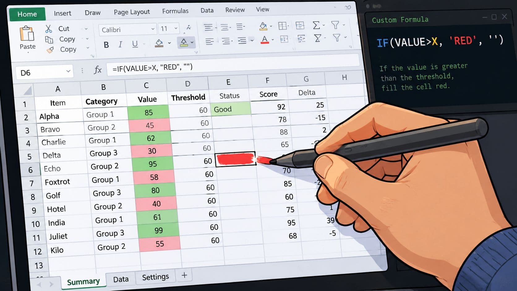
Built-in rules are useful, but custom formulas are where Excel starts behaving like a real management tool. This is how you highlight an entire row based on a single cell, create dependency-aware alerts, and keep trackers readable without stuffing them with helper columns.
A common example is a project plan with columns for task name, owner, due date, and status. If the status cell says Complete, you may want the whole row to turn green. If it says At Risk, the whole row should shift to amber. That gives you a sheet people can scan line by line without reading every cell.
The row-highlighting formula that matters
The setup is straightforward:
- Select the full table range you want to color
- Open Conditional Formatting
- Choose New Rule
- Select Use a formula to determine which cells to format
- Enter a formula that points to the status column for the first row in the selected range
If your status is in column D and your data starts on row 2, a formula would follow the same logic as =$D2="Complete" for one rule and =$D2="At Risk" for another. The dollar sign locks the column. The row remains relative so Excel evaluates each row against its own status cell.
That absolute-versus-relative reference pattern is what trips people up. Lock the column that holds the decision. Leave the row flexible so the rule travels correctly.
The formula doesn't need to be complicated. It needs to be anchored correctly.
Word-based rules are often enough
Not every workbook needs a custom formula from day one. If you just need to color-code exact words, Excel already gives you a simpler route. You can use the Equal to rule in Conditional Formatting and type the exact target word, such as Mastery, to trigger a format automatically, as shown in this word-based Excel conditional formatting example.
That's useful in training logs, approval trackers, QA lists, and skills matrices where text values drive the next action.
Why system design matters more than technical cleverness
The technical skill is only half the job. The bigger question is whether your colors will still make sense six months from now when someone else inherits the file.
That's why I don't recommend building highly personalized color logic that only one person understands. If green means “done” in one sheet, it shouldn't mean “needs input” in another. If amber signals risk, reserve it for risk. Treat color as shared language.
A durable setup usually follows these principles:
- One color, one meaning across the workbook
- Formula rules tied to real decisions, not decorative categories
- Minimal overlap so multiple rules don't compete visually
- Readable fallback cues such as status text, not color alone
The strongest spreadsheets aren't the fanciest ones. They're the ones that a tired colleague can open, even after a long workday, and still interpret correctly.
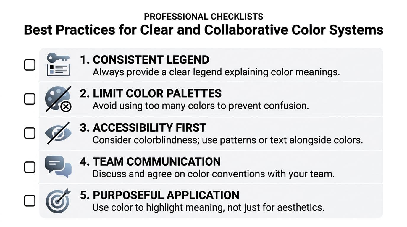
Best Practices for Clear and Collaborative Color Systems
Most Excel tutorials stop after the click path. That's where problems begin.
Many professionals use ad-hoc color schemes without universal standards, which creates confusion. That's especially hard on busy executives, project managers, and neurodivergent professionals who depend on clear visual signals. The practical fix is to establish standardized color conventions for inputs, formulas, and outputs, a gap that's often discussed informally but rarely formalized in basic training, as reflected in this discussion of Excel color conventions.
Build a shared visual language
If a workbook is used by more than one person, put the rules in writing. A small legend on the sheet often solves more confusion than another hour of formatting tweaks.
A good team standard usually includes:
- Status colors: what red, amber, and green mean
- Input formatting: how users should recognize editable cells
- Formula outputs: how calculated values differ from manual entries
- Escalation flags: which color indicates action is required now
This doesn't need to be elaborate. It needs to be consistent.
Keep the palette tight
More colors don't create more clarity. They usually create hesitation.
Limit your palette to the smallest set that communicates the decisions people need to make. If every other cell has a different shade, the eye stops trusting the signal. For collaborative workbooks, fewer colors almost always outperform elaborate palettes.
A color should answer a question. If it doesn't, remove it.
Accessibility and logic come before style
Color alone shouldn't carry the full meaning. Pair it with status text, icons, symbols, or labels so the sheet remains usable for people with different visual needs and different working styles.
This matters even more when rules stack across ranges. One practical best practice from finance-focused Excel guidance is to build numerical range rules in ascending order, from smaller values to larger ones, to avoid overlapping logic errors. A cited example starts with values greater than 0 as red, then values greater than or equal to 60 as pink in this discussion of Excel color-coding rules.
That sounds minor until a workbook starts behaving unpredictably. Then it becomes the difference between a trustworthy dashboard and a misleading one.
Think beyond the sheet
There's also a bigger pattern here. Manual formatting gave way to conditional rules because people needed consistency. VBA extended that when teams needed more automation. The next step is systems that adjust visual signals with less manual setup.
That shift matters because task management isn't static anymore. Priorities move. Deadlines shift. Ownership changes. The color system has to keep up.
Beyond Static Rules The Future Is Automated

A lot of people still treat color coding in Excel like a finishing touch. It isn't. In active work, it's part of the control system.
Static rules already improve a spreadsheet dramatically, but they still depend on someone predicting the right conditions in advance. That's the limit. Traditional conditional formatting is excellent at answering known questions. It's weaker when the question itself keeps changing.
Where VBA fit in
For years, VBA handled that gap. If you needed Excel to react to more complex workflows, update formatting across sheets, or trigger logic after data entry, VBA was the usual route. It still has value for mature internal workbooks with repetitive processes and stable ownership.
But VBA comes with familiar trade-offs:
- It's harder to maintain when the original builder leaves
- It creates dependency on a smaller pool of power users
- It can solve technical problems without solving usability problems
That last point matters. More automation doesn't automatically mean more clarity.
The next shift is adaptive color logic
The more interesting development is AI-assisted highlighting. The emerging model is that color won't only react to fixed formulas. It will adapt to changing priorities and patterns.
One credible framing of that shift is that the next step in color coding is dynamic, AI-assisted highlighting that adapts to real-time priority changes, with capabilities emerging alongside tools such as Microsoft 365 Copilot. The emphasis is moving from static formula-based rules toward predictive visual cues that help users stay focused on what needs attention next, as described in this overview of AI-assisted Excel color workflows.
What busy teams should take from that
The practical lesson isn't that every spreadsheet should become an AI project. It's simpler than that. Build your files so color reflects decisions, not decoration. Start with clean status fields. Use consistent meanings. Automate what can be automated. Then look for tools that reduce manual rework even further.
That's the future of spreadsheet work for overloaded teams. Less hand-maintained formatting. More responsive systems. Better visibility with less effort.
If your current workbook still relies on people remembering what to color and when, it's already behind the way work progresses.
If you're trying to move beyond spreadsheet upkeep and into a clearer task system, Fluidwave is worth a look. It combines AI-driven task organization with human delegation, which makes it useful for professionals who need priorities surfaced clearly, work handed off quickly, and progress kept visible without constant manual maintenance.
Focus on What Matters.
Experience lightning-fast task management with AI-powered workflows. Our automation helps busy professionals save 4+ hours weekly.